Google · Android
Building the visual foundation for Android’s first desktop-class windowing
Why it matters. Entering the tablet market late, Pixel needed a reason for people to choose it. Desktop Windowing was that reason, moving the device from media consumption to laptop-level productivity. The goal wasn’t just adding another device to the lineup — it was the first step toward Android’s large-screen ecosystem.
The challenge. Building this experience ran into two hurdles: strict hardware rendering limits that capped multi-window visual depth, and fragmented interaction models that disconnected the new workspace from the rest of the OS.
The approach. Working from the engineering constraints, I ran edge-case studies to design header states that hold across 10+ color themes. After auditing existing OS architectures, I designed an elevation model for Android that keeps the visual quality with fewer layers to render. I resolved the open interaction questions with hypothesis-driven A/B testing, aligning each workflow with the mental model people already had. Rather than treating desktop mode in isolation, I unified drag-and-drop across the OS, so windowing and the native split-screen read as one feature.
The impact. This foundation achieved premium visual quality without a performance cost. It became the OS-level baseline, scaled to connected displays, and set the multitasking standard for OEM partners.
Project overview
Desktop multitasking for Google’s first tablet
As a late entrant to the tablet market, Pixel needed a compelling software differentiator beyond standard split-screen functionality.
As the visual lead, I owned the entire visual layer end to end: window states, feature components, multi-instance behavior, color systems, and spatial elevation.
01 Header State
Problem
Defining visual priority in a multi-window environment
In desktop mode people attach a keyboard and mouse, so the focused window decides where every keystroke lands. Identical visual weight across overlapping windows left that unreadable.
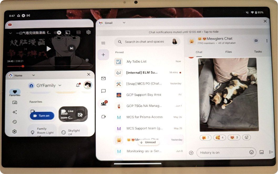
Focus ambiguityNothing on screen said which window was focused, so users typed into the wrong one.
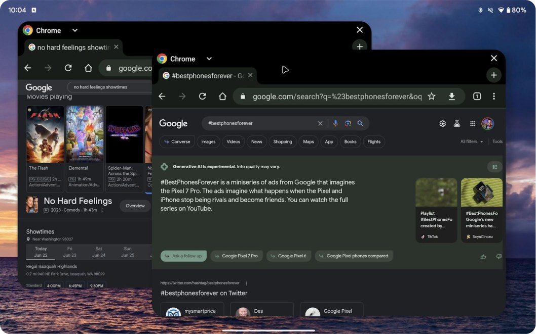
Content blendingBoundaries vanished where windows met, causing apps to visually merge into a single surface.
Constraints
Why the obvious fix didn’t work
I first tried lowering the opacity of the unfocused header background. A 1:1 with engineering showed why Android’s rendering wouldn’t allow it.
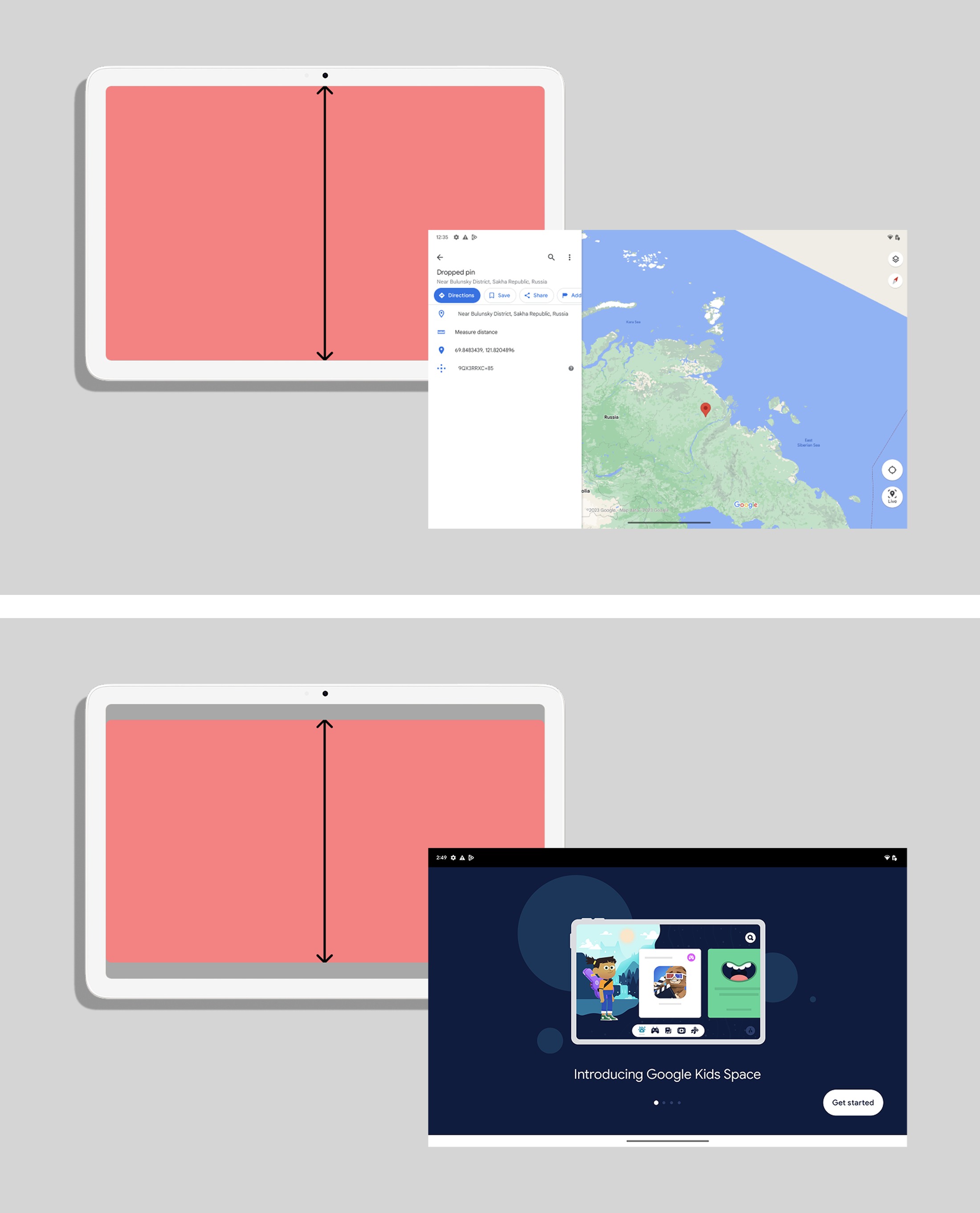
Opaque header requirementTop, edge-to-edge rendering. Bottom, inset-based rendering. Dimming the system-drawn background causes underlying app content to bleed through unreadably — differently in each mode, across a million apps.
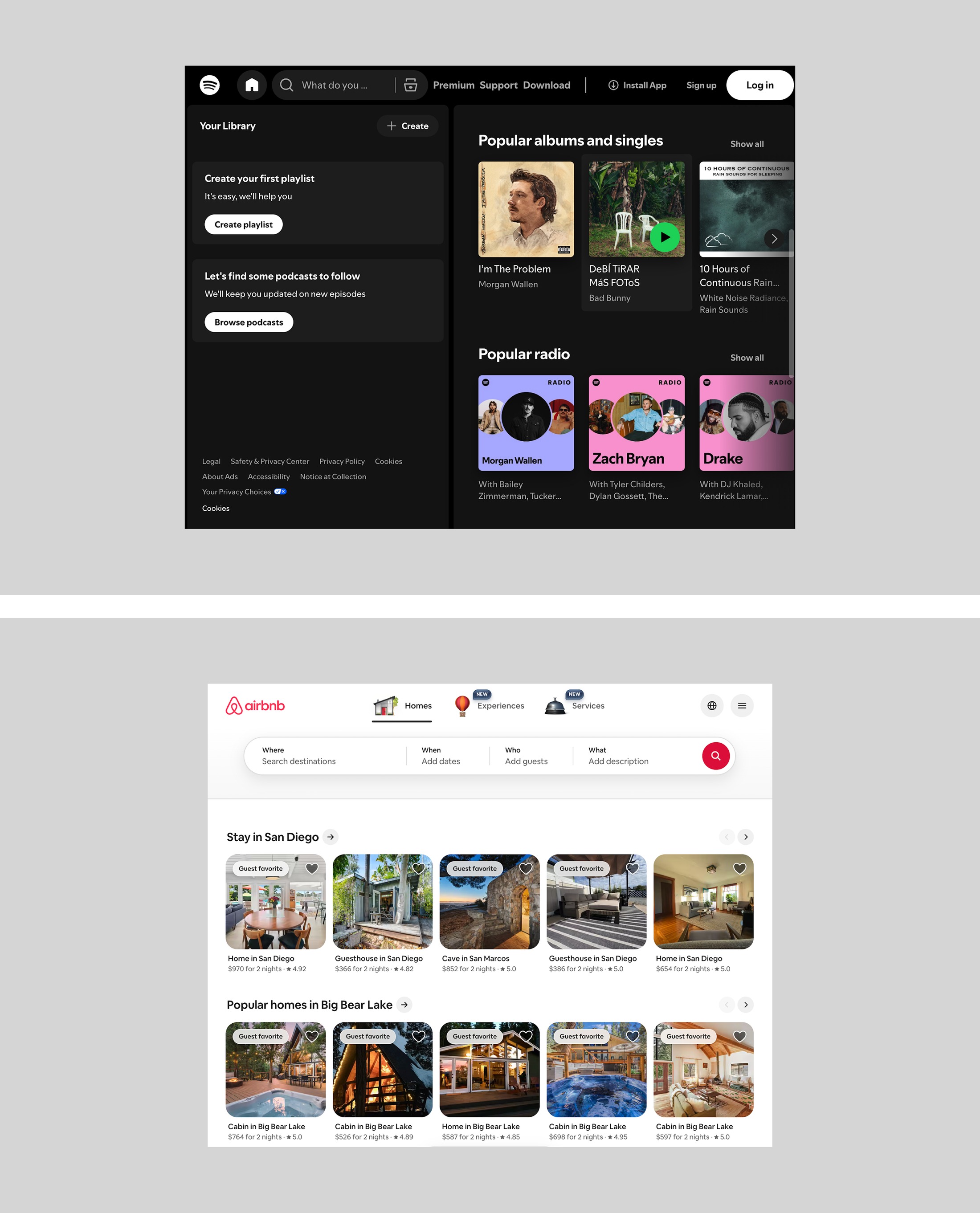
Brand-enforced themesTop, Spotify stays dark. Bottom, Airbnb stays light. Major apps lock their brand colors, so forcing a system-level color overlay destroys the app’s visual identity.
The engineering reality dictated a new rule: dim the foreground elements, never the background surface.
Iterations
Only the app icon and the label were left to carry state
Three ways to use them. Two of them cost more than they gave.
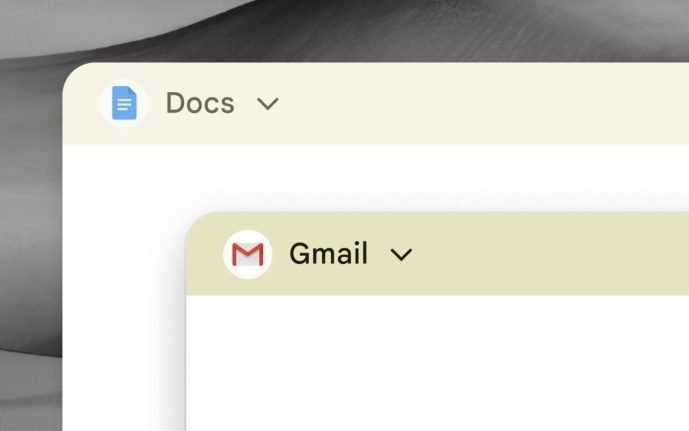
The only option that doesn’t borrow a meaning Android already uses, and the only one that leaves the app’s own colors untouched.
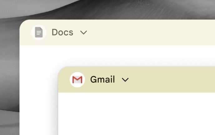
Fails due to semantic conflict — gray already signifies a disabled state in Android.
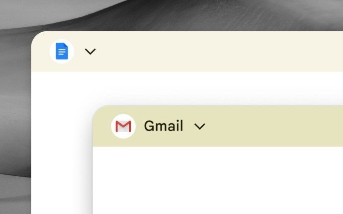
Fails due to context loss; users can no longer identify the window’s app.
Color matrix
One header color matrix, eleven themes
State (focused / unfocused) × device theme (light / dark) × app behavior (adaptive / theme-locked). One set of pairings had to hold for the ordinary case and the awkward ones at the same time.
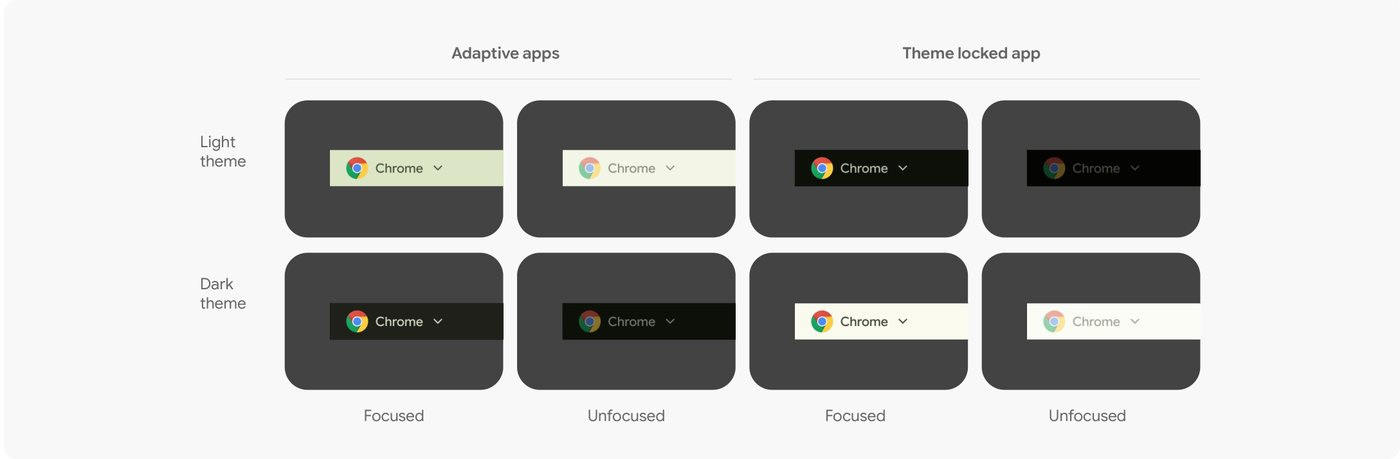
Android had no color resource built for this, so I worked inside the tokens it already had — pairing them until focused and unfocused stayed clearly apart in light and in dark, and testing every pairing to 4.5:1. The combination I landed on holds across 10+ themes.
Hardcoding the values would have been faster and wrong. It breaks Android’s themeable color logic, and it leaves a component nobody can maintain and no OEM partner can adopt without migrating to new values. Staying inside the token system is what makes it portable.
02 Elevation
Depth
The limits of color in spatial hierarchy
Color differentiates state, but fails to establish physical depth when identically themed windows overlap. I introduced a new elevation model to define structural space.
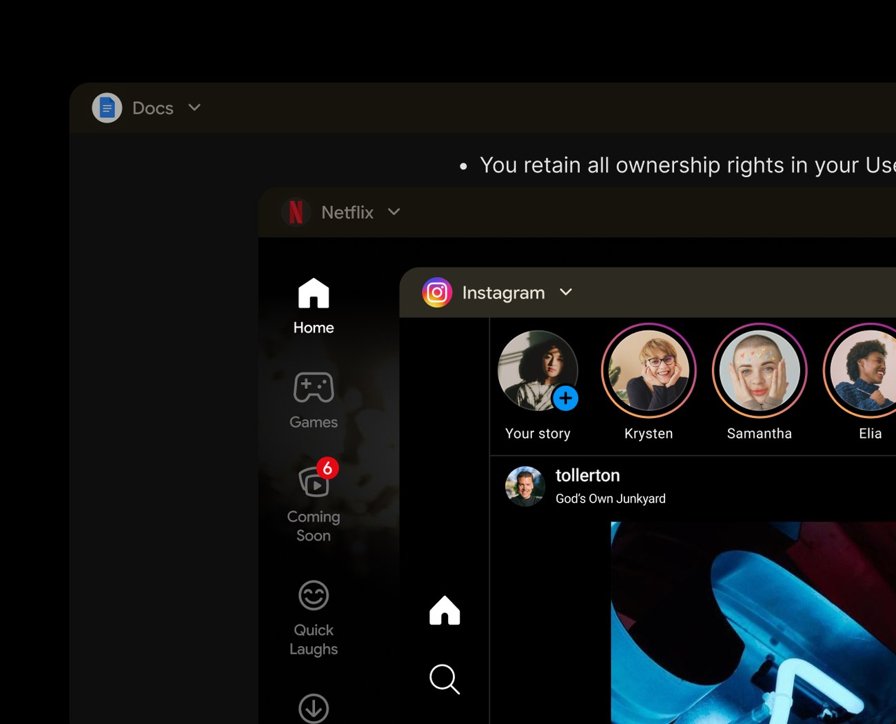
Dark app over a dark themeThe header blends into the background app, visually flattening the hierarchy.
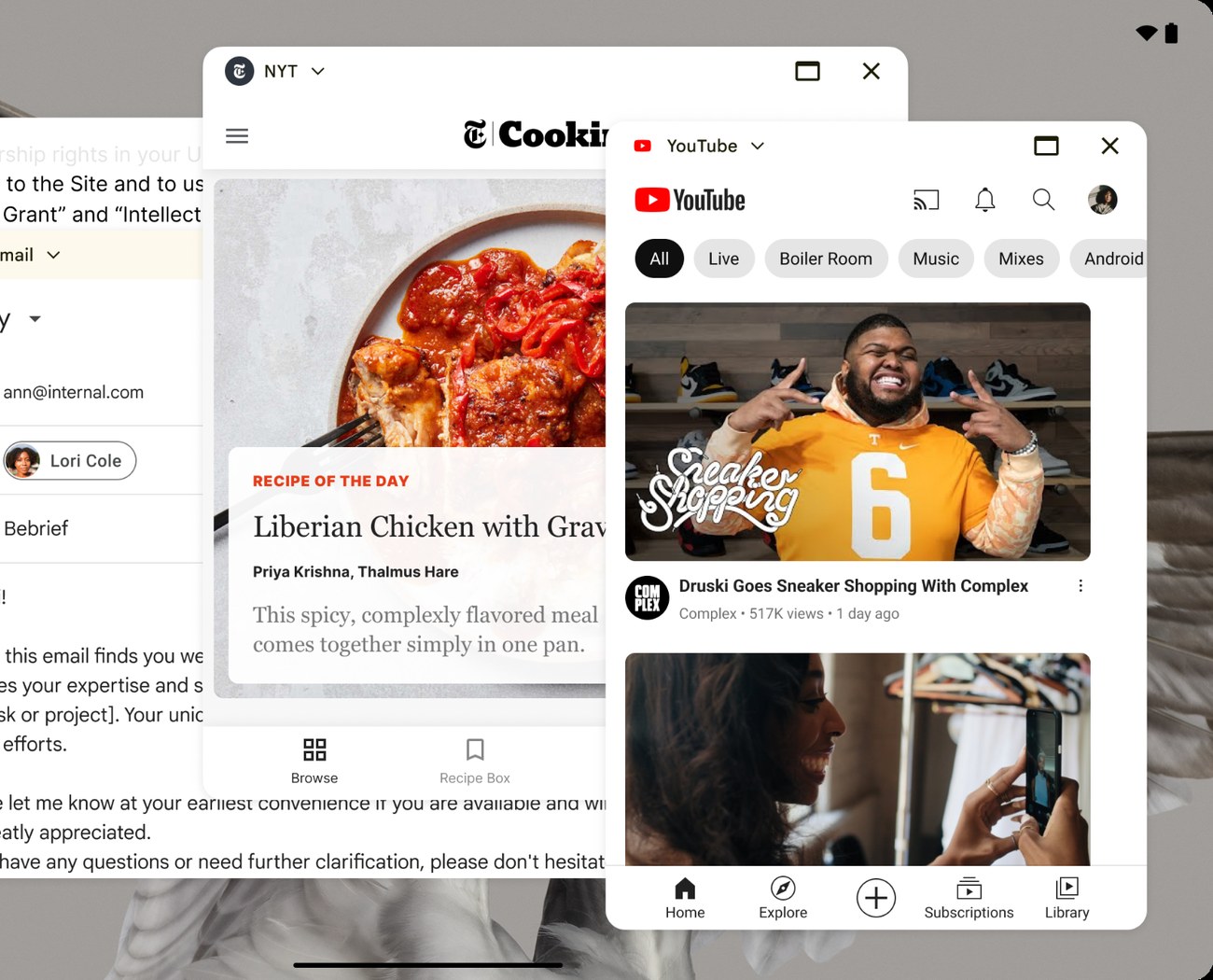
Light app over a bright wallpaperColor alone cannot establish structural depth in a multi-window environment.
System audit
Architectural audit
I tore down the rendering architectures of both Chrome OS and the standard Google Material guidelines, mapping their limitations against the new windowing requirements.
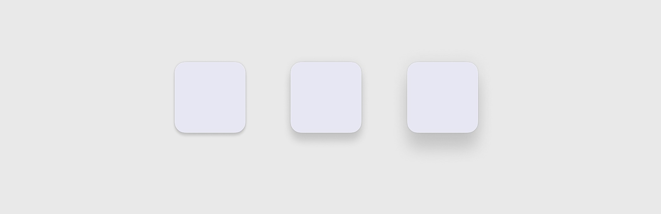
Heavy 5-layer renderingTwo strokes, two shadows, and a background blur — too resource-intensive for tablets. In addition, its baked-in blue tint conflicted with Android’s Dynamic Color.
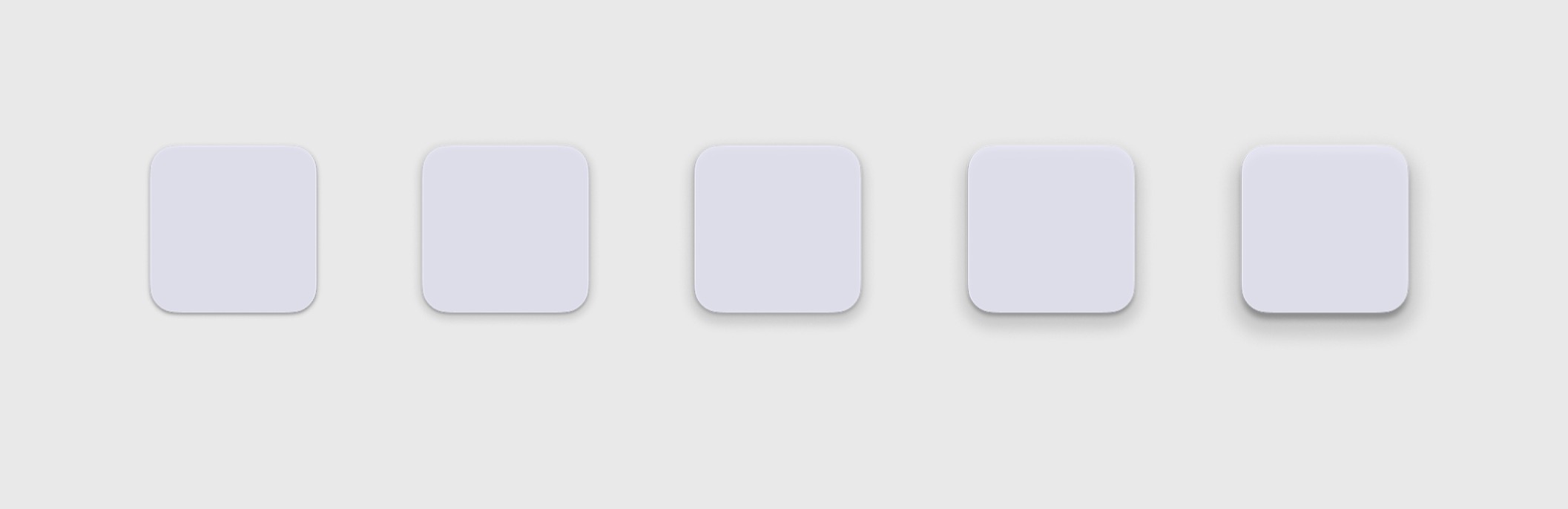
Flat elevation modelLacked the spatial hierarchy needed to ground components against each other.
The goal: find a structural boundary that is lightweight to render, yet premium in appearance.
New architecture
A lightweight structural boundary
I designed a highly performant boundary system: two shadows for depth, and a single, un-tinted gray hairline stroke to define the edge exactly where two windows meet.
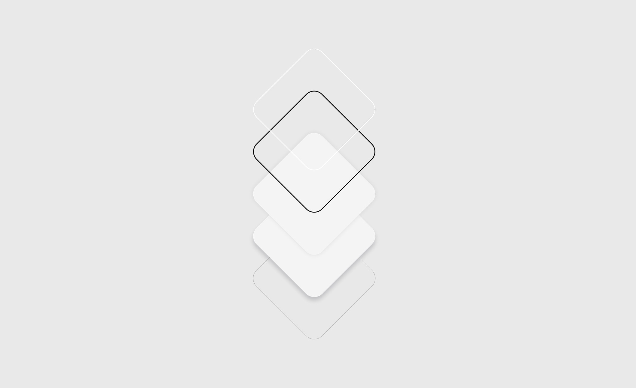
Stroke 2 + Shadow 2 + blurRequires compositing five layers on every frame.
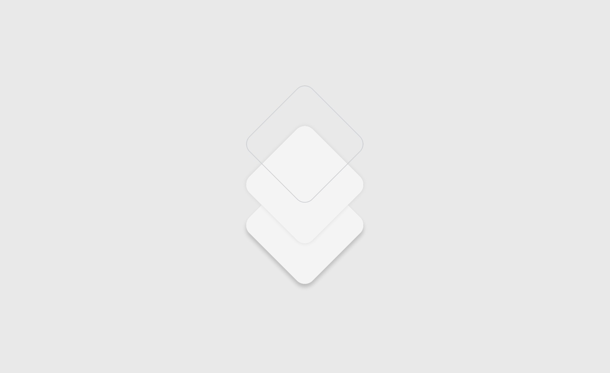
Gray stroke 1 + Shadow 2Highly performant. Stress-tested across dynamic wallpapers, opposite polarities, and low device brightness.
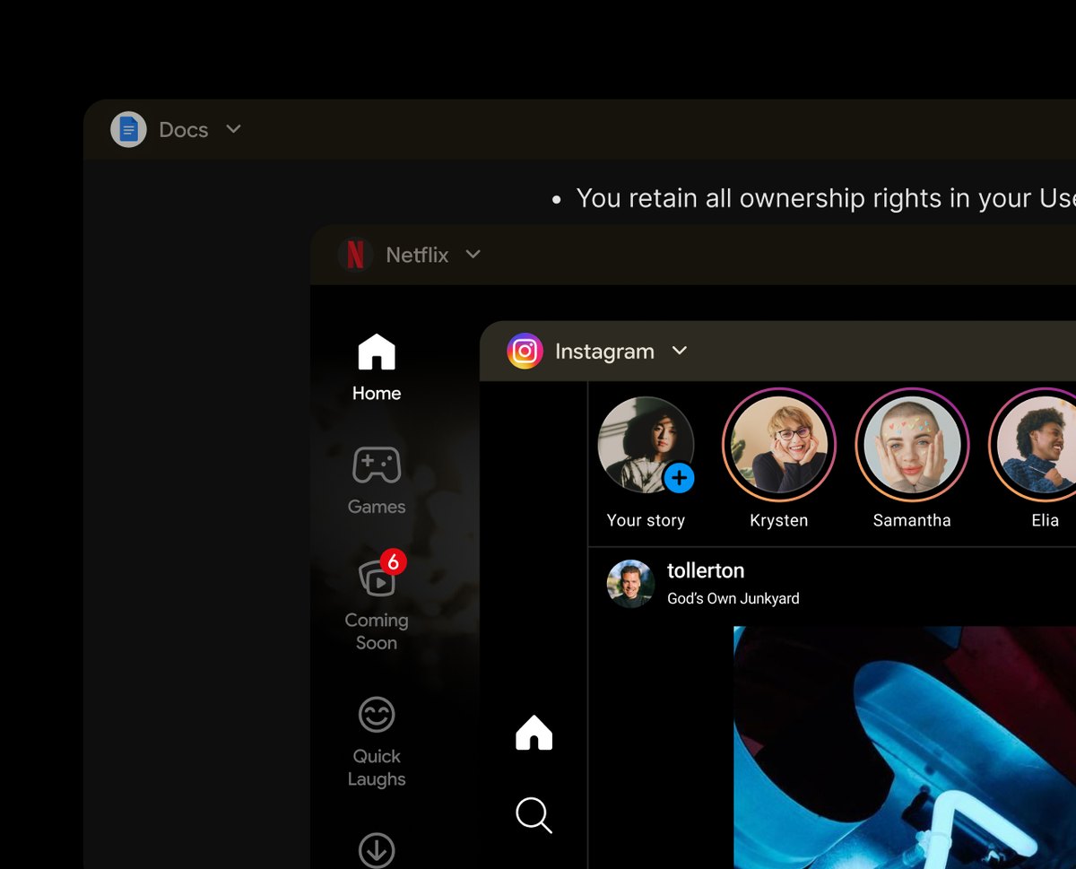
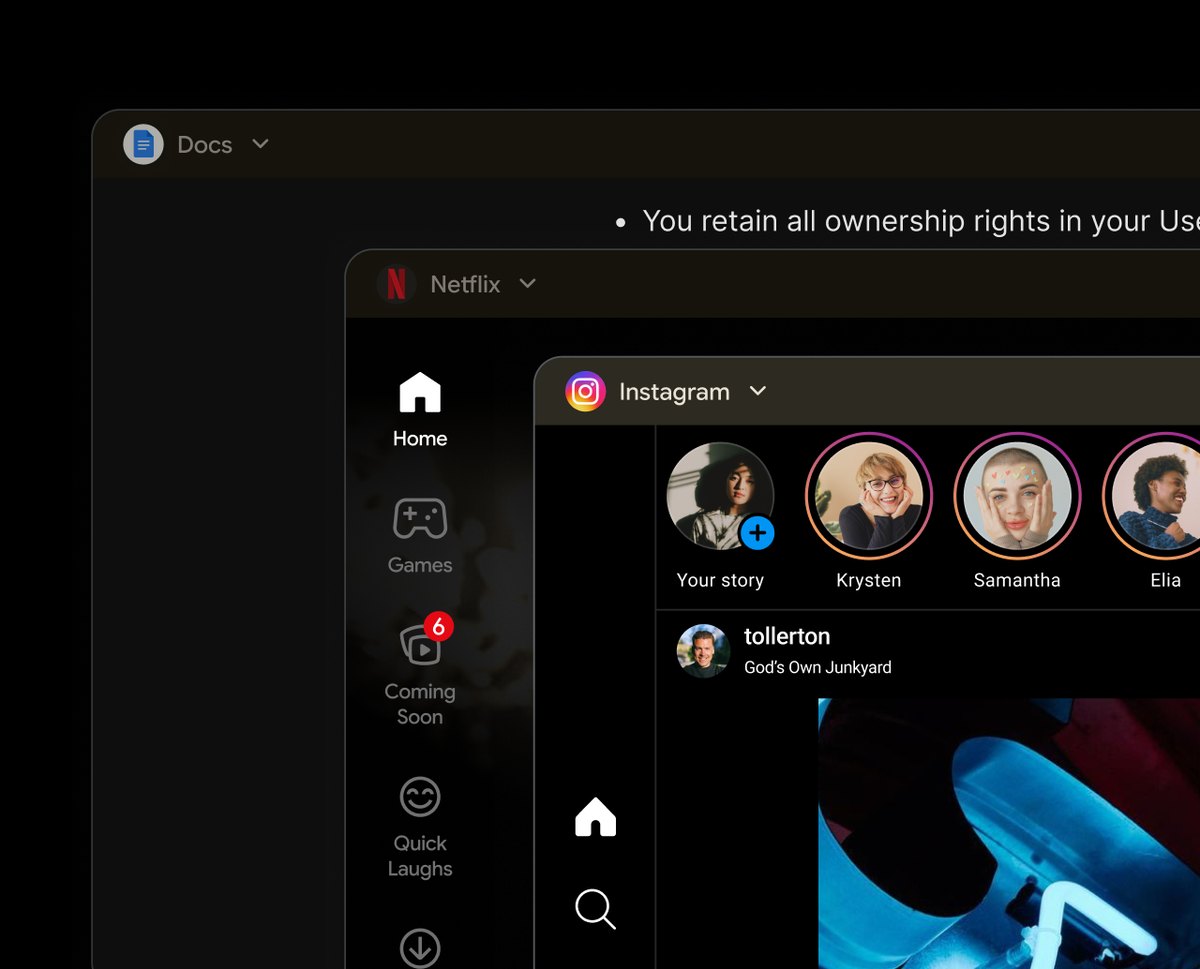
Crisp boundaries without content blending
The stroke and shadow dynamically adjust to the window’s state, clearly positioning the focused window at a higher spatial elevation.
Impact
Establishing the ecosystem standard
It went on to carry connected display, too. When desktop windowing moved beyond the tablet and onto external monitors, the header states, the elevation model, and the color token pairings came with it as the base layer. The new surface started from an established system instead of from a blank page — which is the real test of a foundation: whether the next feature can stand on it.
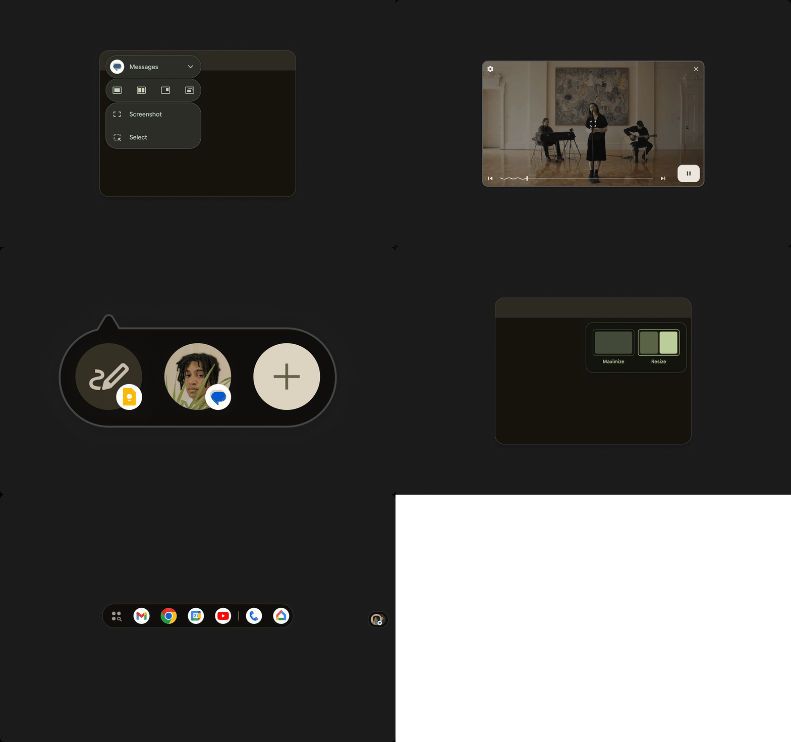
Adopted across the OSTaskbars, bubbles, and picture-in-picture were all realigned to this new depth language.
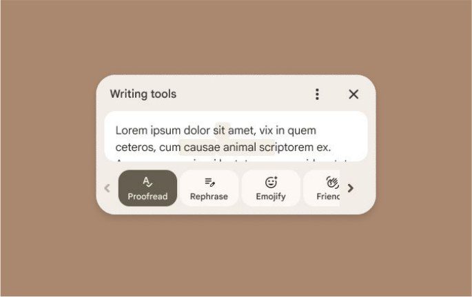
GboardThe rules scaled outside of multitasking, proving the system’s robustness.
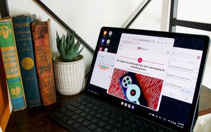
Samsung tabletsThis foundation became the shared baseline for Android tablet desktop mode across partners.
03 Snap Tiling
Context
Eliminating manual micro-adjustments
Windowing should keep users focused on their tasks, not on manually resizing borders. User research called out this friction: manual micro-adjustments frequently led to errors, such as accidentally triggering full-screen mode. This drove the need for a predictable, immediate snap.
Design goal — eliminate manual layout friction. Drag a window to the edge, and it instantly snaps into a half-screen.
Initial approach
Testing the traditional OS pattern
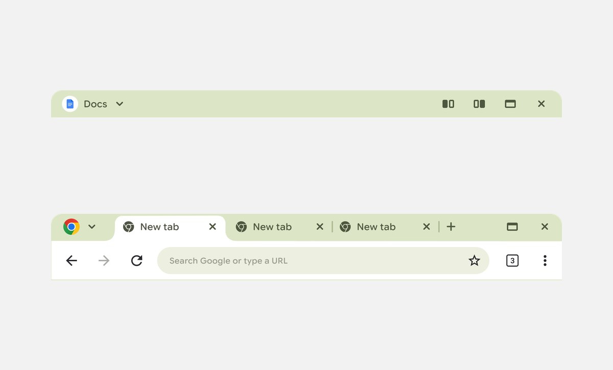
No room in the headerSnap controls would have to sit in the header, next to the app’s own content — and Chrome puts its tabs there. What belonged in that header hadn’t been settled yet, so every control put there cost something.
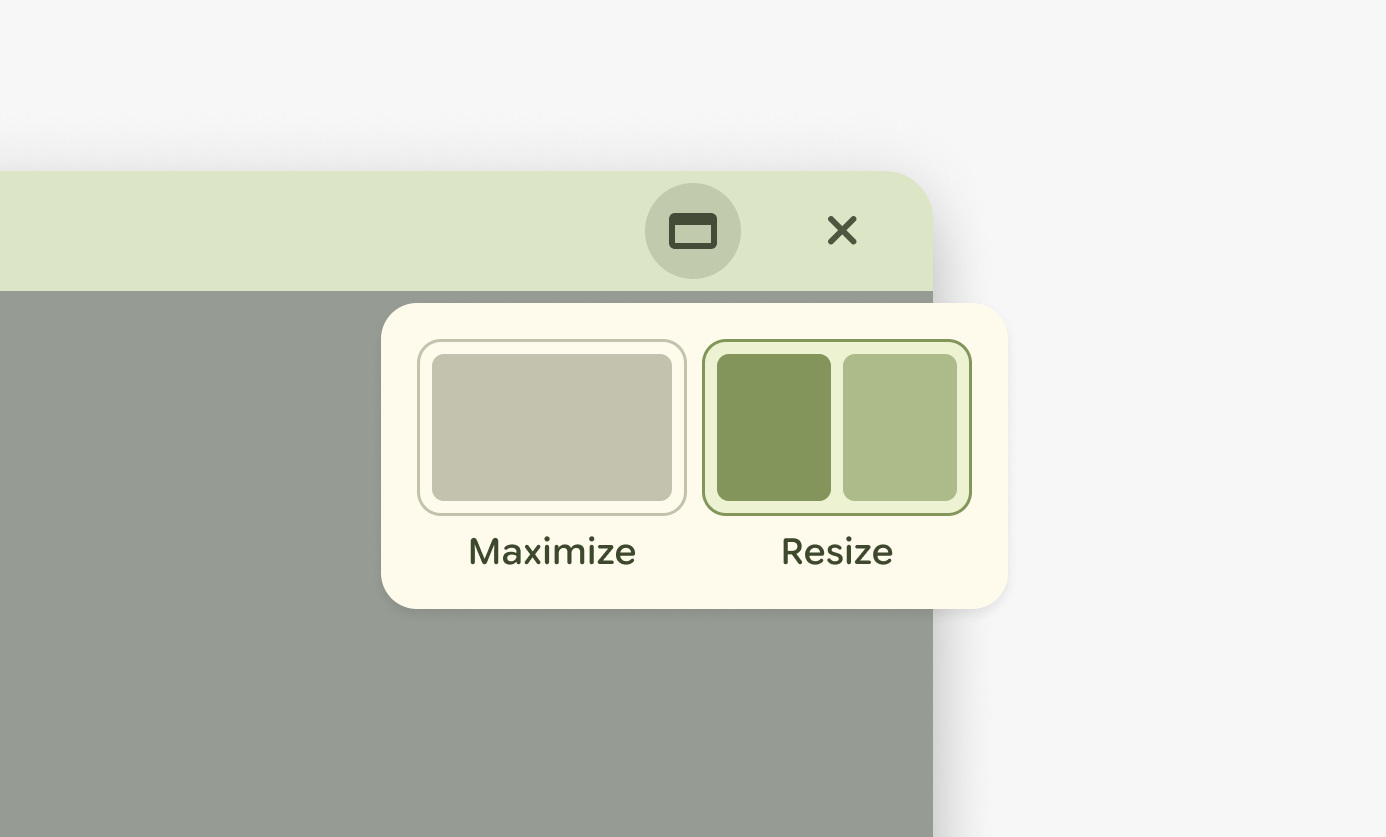
Adapting a pattern users already knewI adapted the Chrome OS long-press menu, on the hypothesis that users would reach for an interaction they already used. It also cost nothing in the header.
Research findings
Discoverability vs. mental models
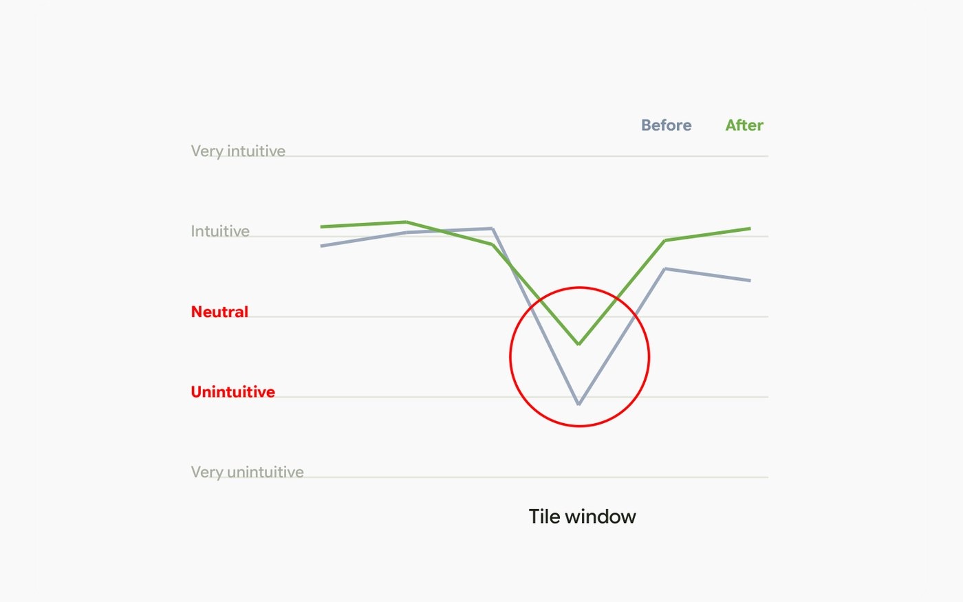
Poor discoverabilityUsers couldn’t find the menu on their own. Telling them where it lived didn’t move the rating either, so this was not something onboarding could fix.
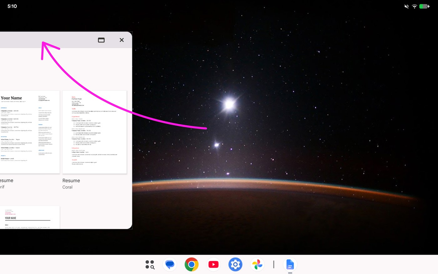
Gesture collisionUsers dragged windows to the screen edge before trying anything else, which triggered the mobile split-screen UI instead of snapping.
Final decision
The edge became the way in
Edge dragging is a habit users bring from the phone. Instead of teaching a new gesture, I put snapping on the one they already used.
Fast, frictionless tilingAchieves layout arrangement instantly without breaking user flow.
Retained for accessibilityA tap-based fallback ensures usability for stylus users and those with mobility impairments.
System consistency
A unified visual language across transitions
Corner radii, scrim opacities, and drop targets were standardized and aligned with system split-screen, ensuring Android multitasking reads as one continuous behavior.
04 App to Web
The gap
The window changed. The app didn’t.
Putting apps in windows makes people expect desktop-level work from them. Apps built for phone screens don’t carry everything their web version has, and the tablet can’t run the desktop app directly — the route is a separate Chrome desktop-web window. The problem was opening it without disturbing the workspace someone had already arranged.
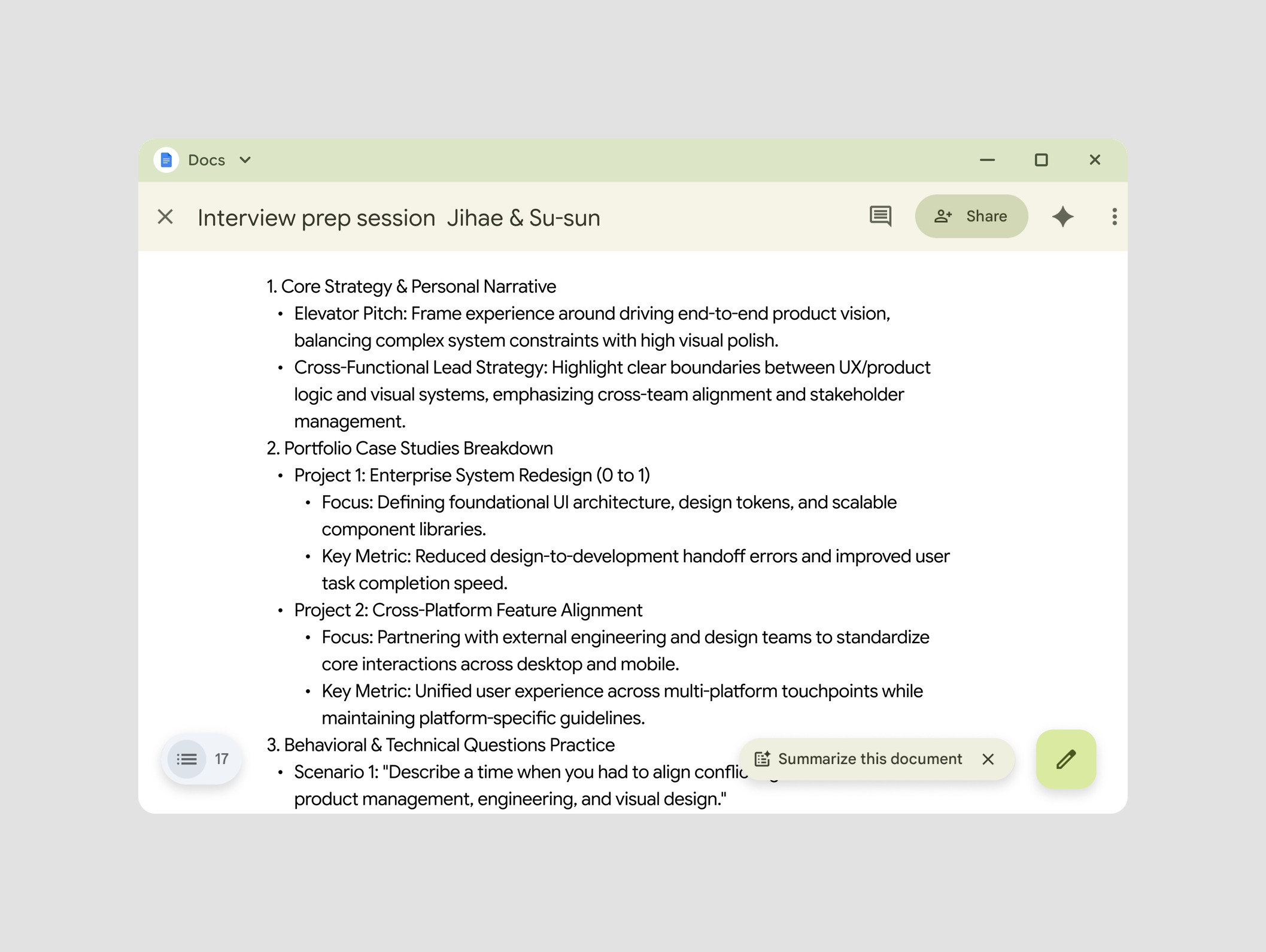
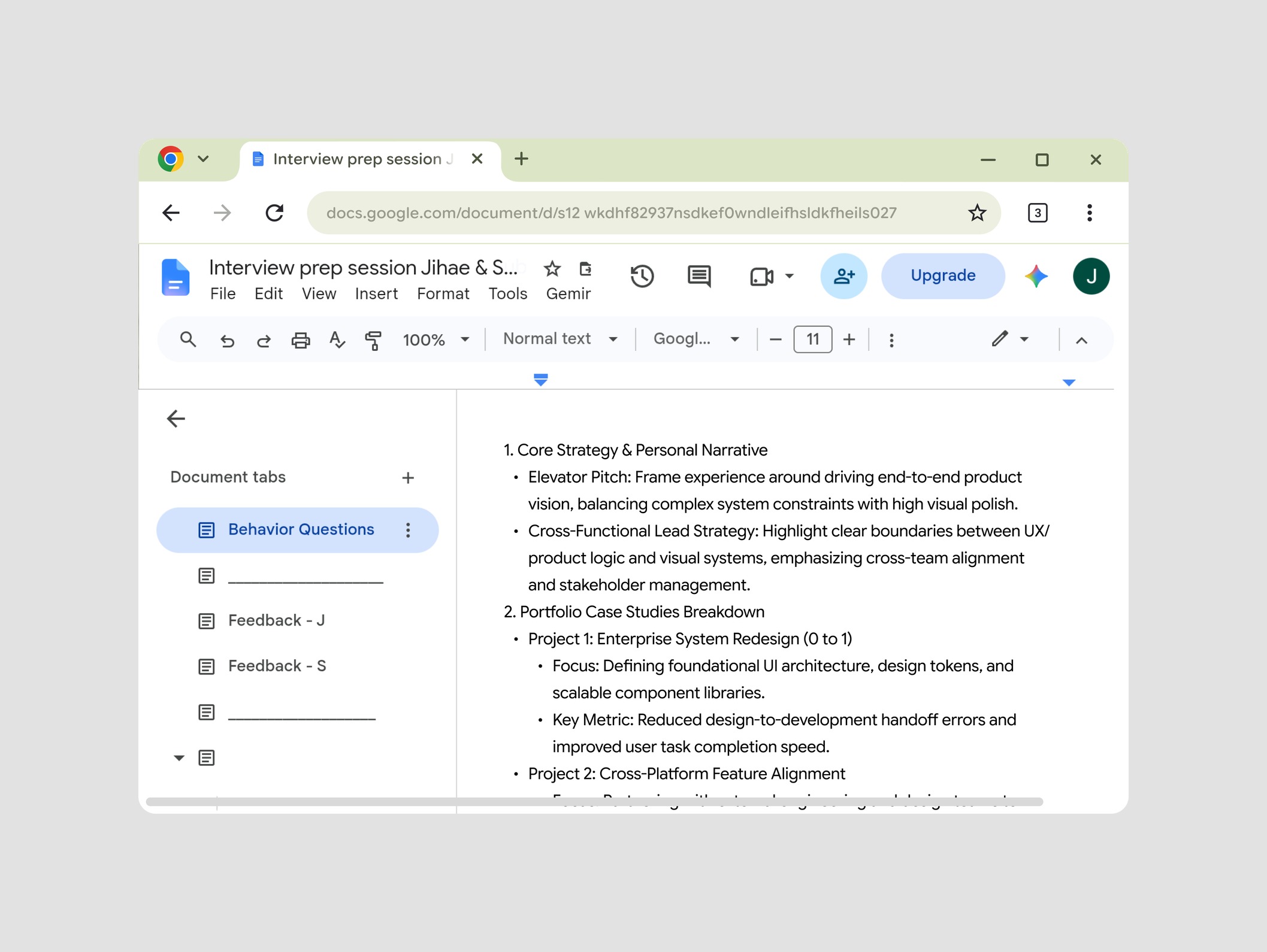
The options
How hard the system pushes
Nothing here was ruled out by a constraint — all three worked technically. So I put them on one axis: how hard the system pushes, from deciding for the user to standing aside and offering.
DiscardedOpening every link in the desktop version destroys the app’s speed and the user’s intent.
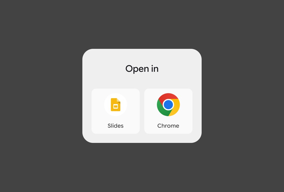
Forces the decisionThe app opens, and a dialog sits over it until the user picks. Predictable, and it stops the task to ask.
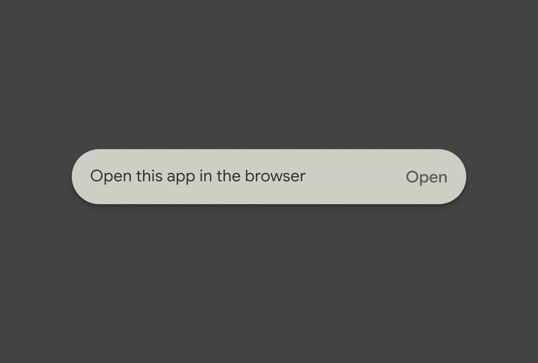
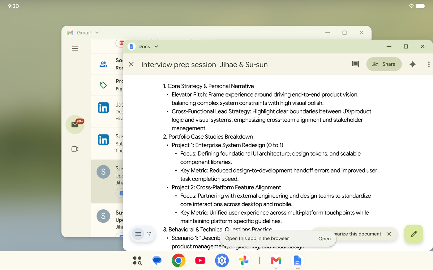
Offers without blockingThe app opens the same way, and a toast points to the web without interrupting. Lower friction, and the user has to notice it once.
User test result
The toast won on preference, not on permanence
The toast won testing because it kept the app-first workflow without blocking the screen. Two frictions came back, and both pointed at permanence.
“Toasts disappear too quickly.”
It dismissed itself, so users missed the moment to switch.
“Need a default setting to stop repetitive prompts.”
A toast cannot hold a preference, so the same decision came back on every link.
Refinement
The preference went into the window menu
Users asked for a default, so I put one in the window menu. A site can be set once instead of asking on every link — and it stays in the window, not in system settings.
Docs links always open in the browser, set from the window menu.
Retrospective
What I would change: Tooltip
The toast opened the door and then closed it again. A tooltip stays until it is dismissed, and it points at the menu where the setting lives.
Fails to educateDisappears too quickly to build awareness.
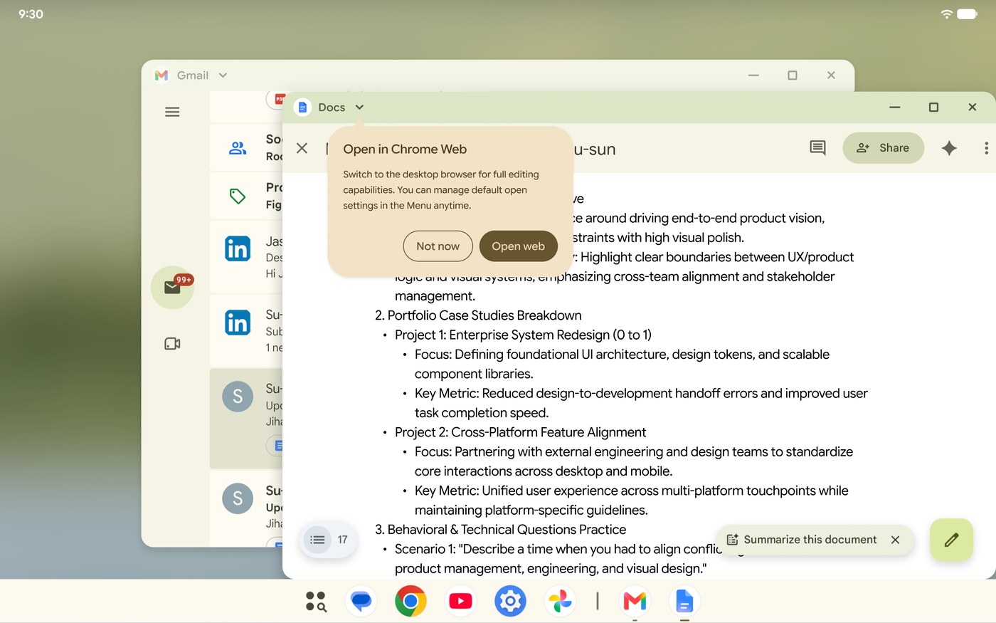
Persistent guidanceStays until dismissed, so it can’t be missed.
Reflection
Three things that didn’t come from the brief
Designing at the OS level meant my work had to survive every app, every theme, and every frame. What I carry forward came from the constraints, from a gap on the team, and from watching users.
Constraints turned into ideas. Going deep with engineering on how Android draws a header didn’t limit the design — it pointed at a lighter model that runs better than the one I started from. Five layers became two shadows and one stroke, and the system got faster for it.
Owning a gap compounds. There was no color designer on the team, so I studied the token system myself — every pairing, every theme, to 4.5:1. That knowledge stayed with me. On later projects I could tell where a color problem would come from, and once a color designer joined, their input became a check rather than a starting point.
Watching users shaped this more than my hypotheses did. I assumed a familiar Chrome OS pattern would carry over, and it didn’t. Time spent hunting for a perfect solution is time not spent finding the right direction, and user testing gave me that direction faster than more thinking would have.