Google · Android
Overview. Material You is Google’s visual foundation. The move into Material 3 Expressive was a rebuild, not a refresh — typography, icons, color logic, and button styles were all redrawn. The goal was to push personalization further across the OS.
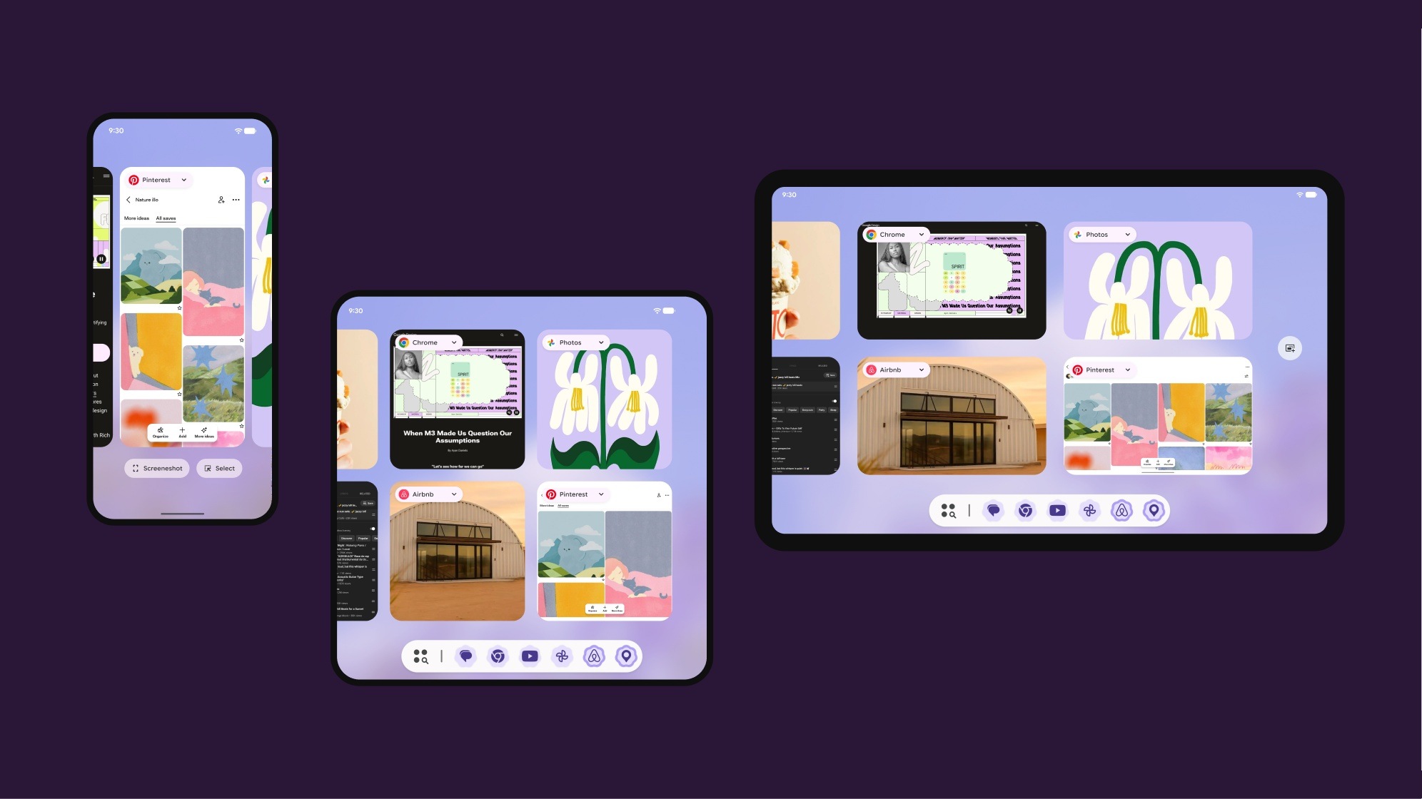
My role. I established the visual precedent: early on, I defined how system (0p) and first-party (1p) apps should adopt the new language. That work became the reference other product teams across Google built on. I also owned the multitasking area end to end, bringing the new Material language to Overview, split screen, and windowing across phone, foldable, and tablet.
The impact. The foundation started on Pixel and spread across Google’s products. The 0p and 1p adoption rules I defined are still how those products take on expressive design today.
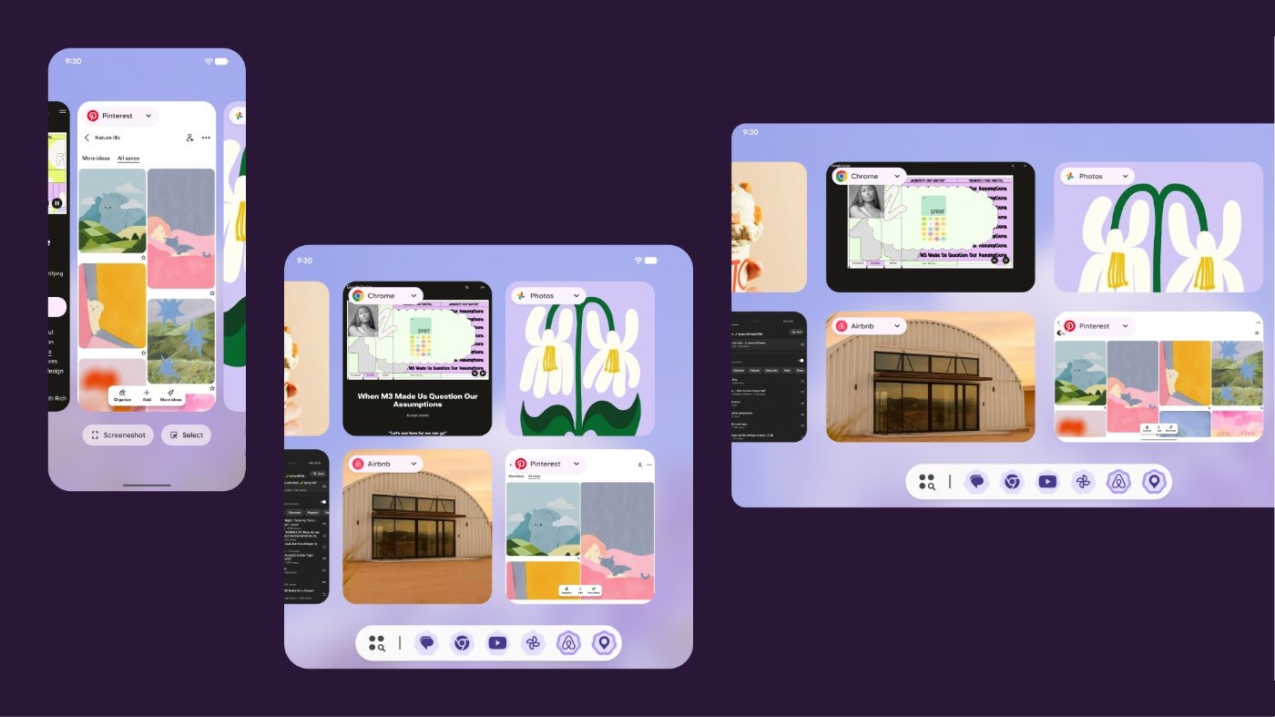
The multitasking area in the new Material look: Overview, split screen, and windowing across phone, foldable, and tablet
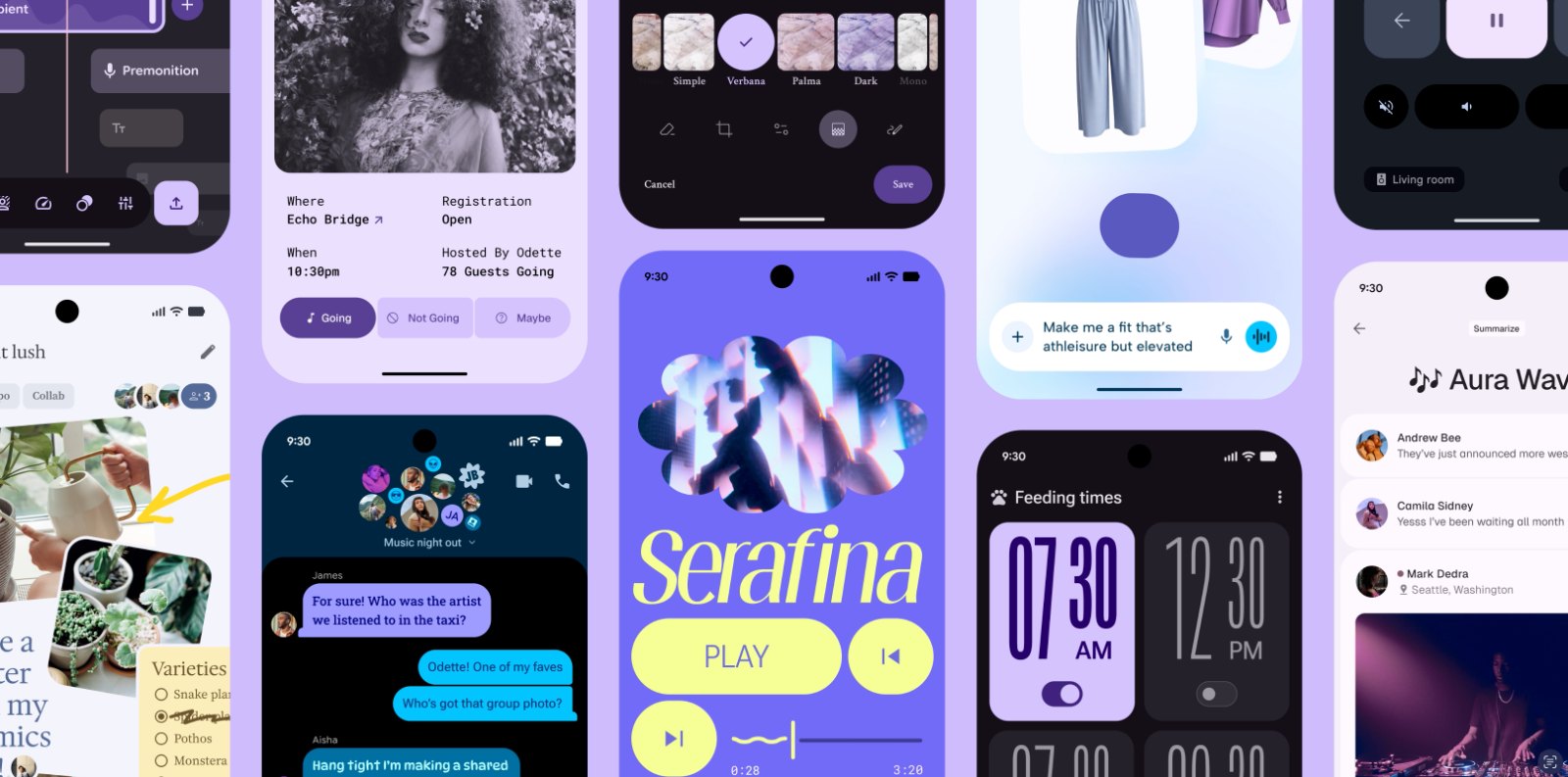
Material 3 Expressive across Google apps. Image © Google
The goal was a visual infrastructure that holds emotional expression and technical logic together — dynamic motion, expressive typography, and adaptive density — so that deep personalization scales across every form factor.
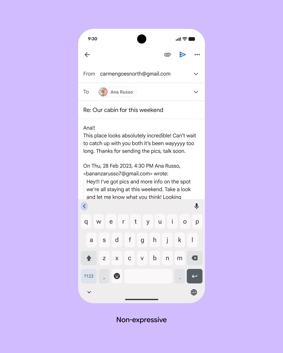
Non-expressive: the Send button in a standard top app bar
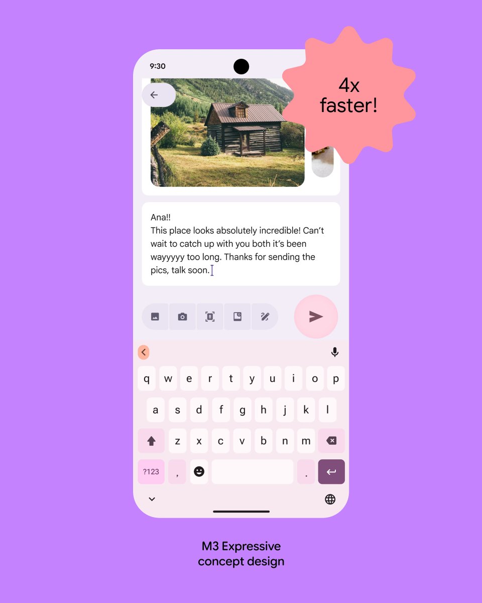
Material 3 Expressive concept: with a larger, more prominent Send button, participants spotted it four times faster
Images © Google, from Google Design research on expressive Material design
The refresh was recognized for system-wide harmony: complex motion and type scales feel like a native part of the Pixel experience, not a layer on top of it. In multitasking, that meant every surface a user moves through between apps speaks the same new language.