Punchcut · A Place for Mom
The challenge. A Place for Mom generates revenue by connecting senior users with care advisors. The business goal was to raise the completion rate of the care assessment and lower its high drop-off rate. But the existing site suffered from ad-like entry points and lacked a critical map feature, and a complete revamp was not an option: the brand colors and typefaces were locked.
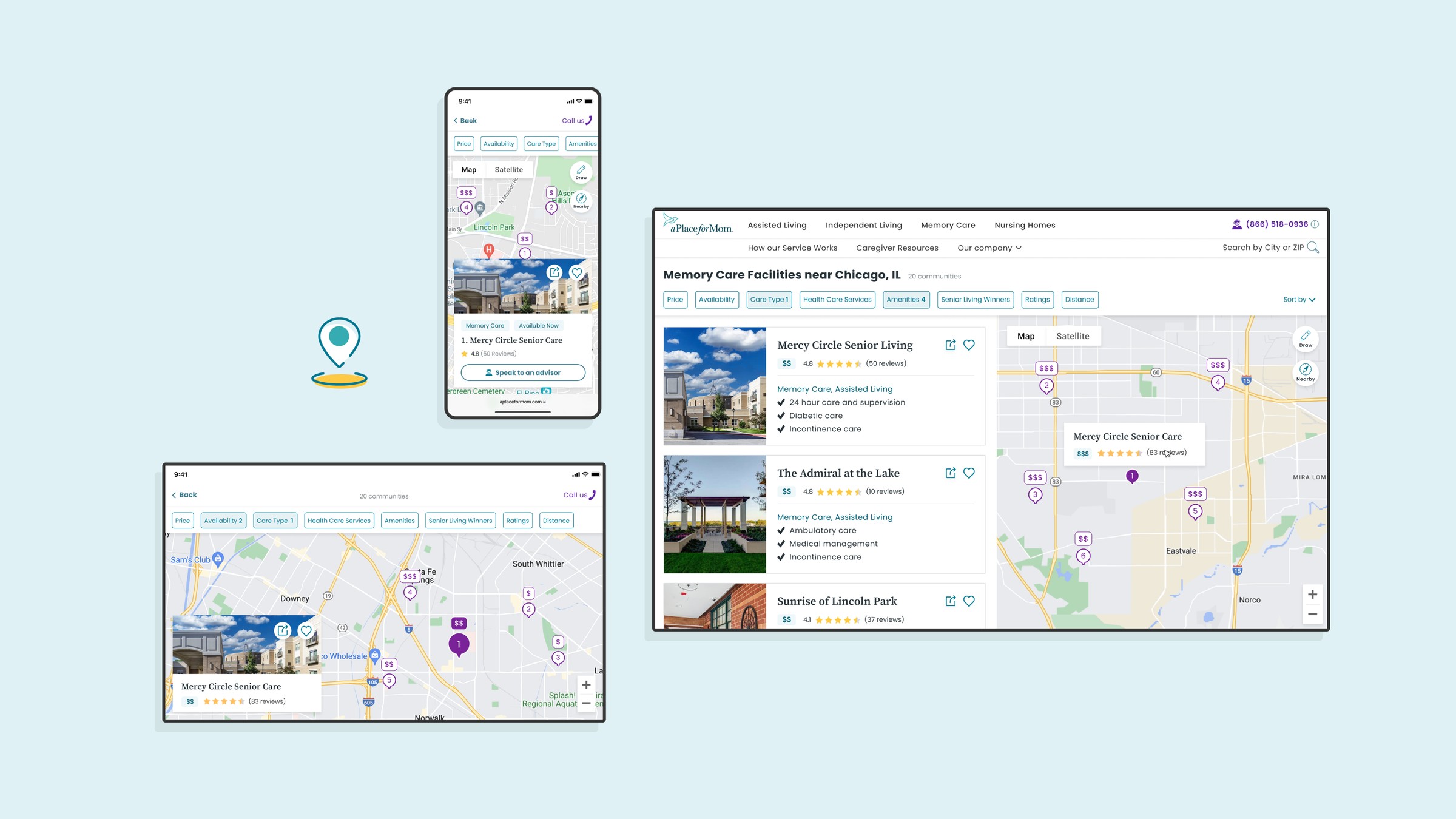
The strategy. I treated those constraints as the brief. I took a welcoming approach, replacing intimidating stock photos with friendly illustrations, repurposed the mixed brand colors with clear psychological intent, and built a fully responsive map MVP from scratch in one week.
The impact. The A/B-tested designs showed that a cohesive, trustworthy experience bridges users to care advisors, and they set a scalable UI system across mobile, tablet, and desktop that keeps the brand’s original heritage.
Project Overview
The core value of A Place for Mom is connecting families who are searching for senior living with expert care advisors. The whole web experience had to guide users gently toward that connection without feeling forceful.
01 Strategy
Repurposing Assets
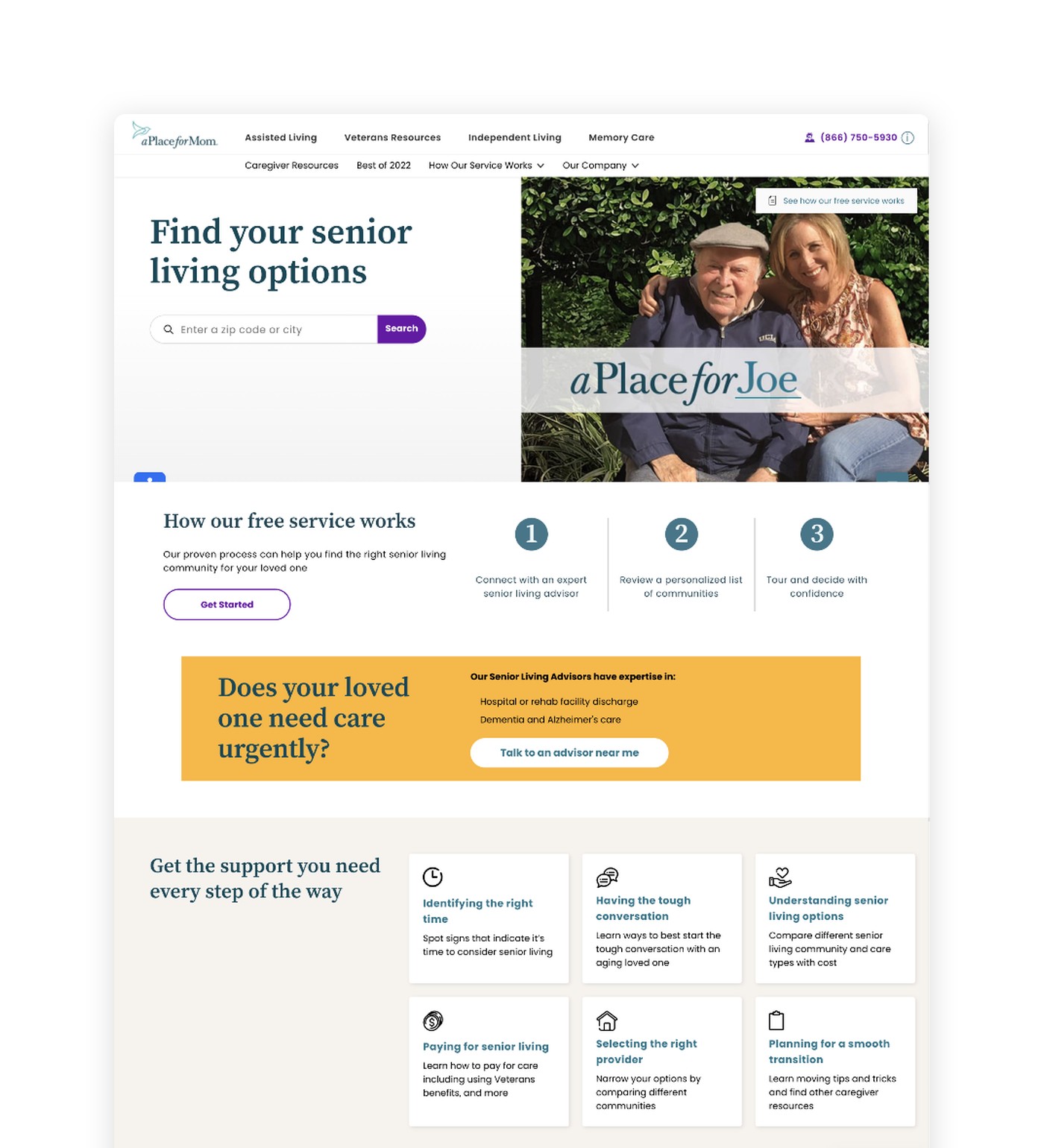
The problem. The site suffered from a low click-through rate and high drop-offs. Scattered entry points and inconsistent use of two primary colors made the modules look like third-party ads, so users hesitated.
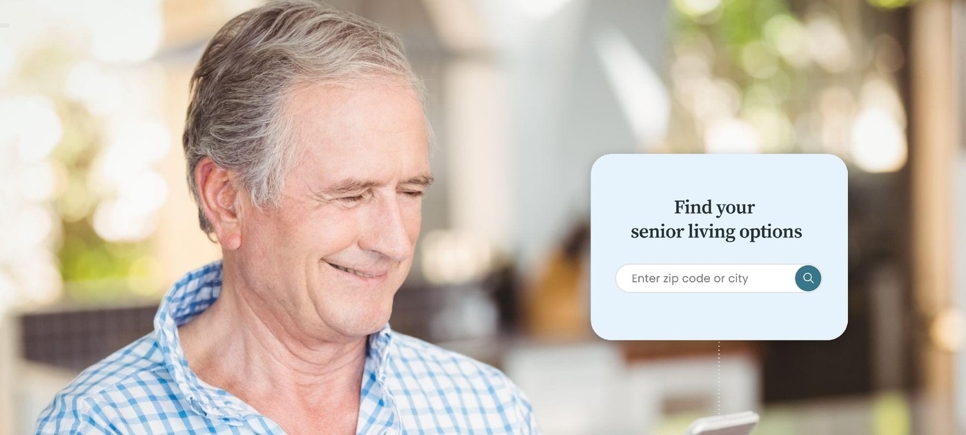
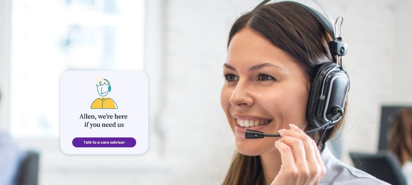
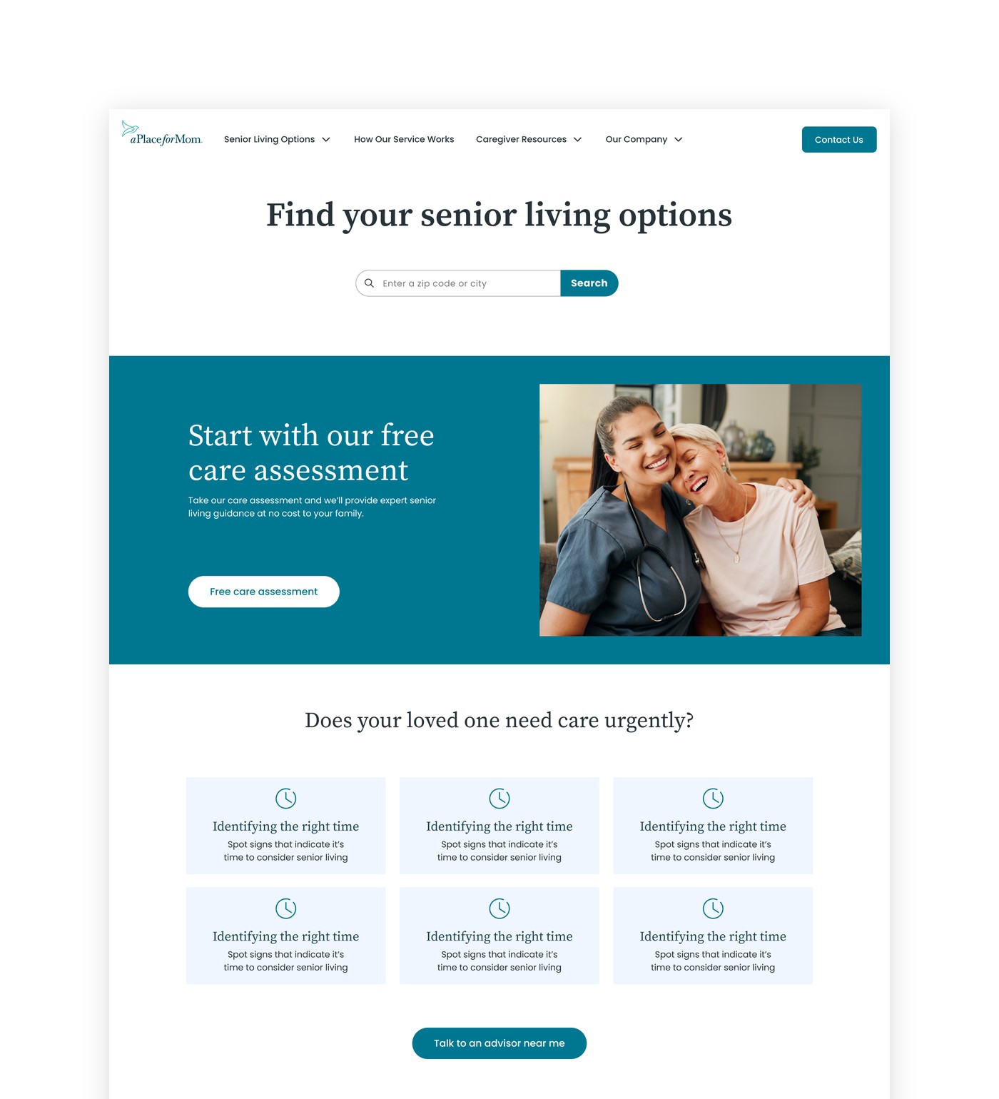
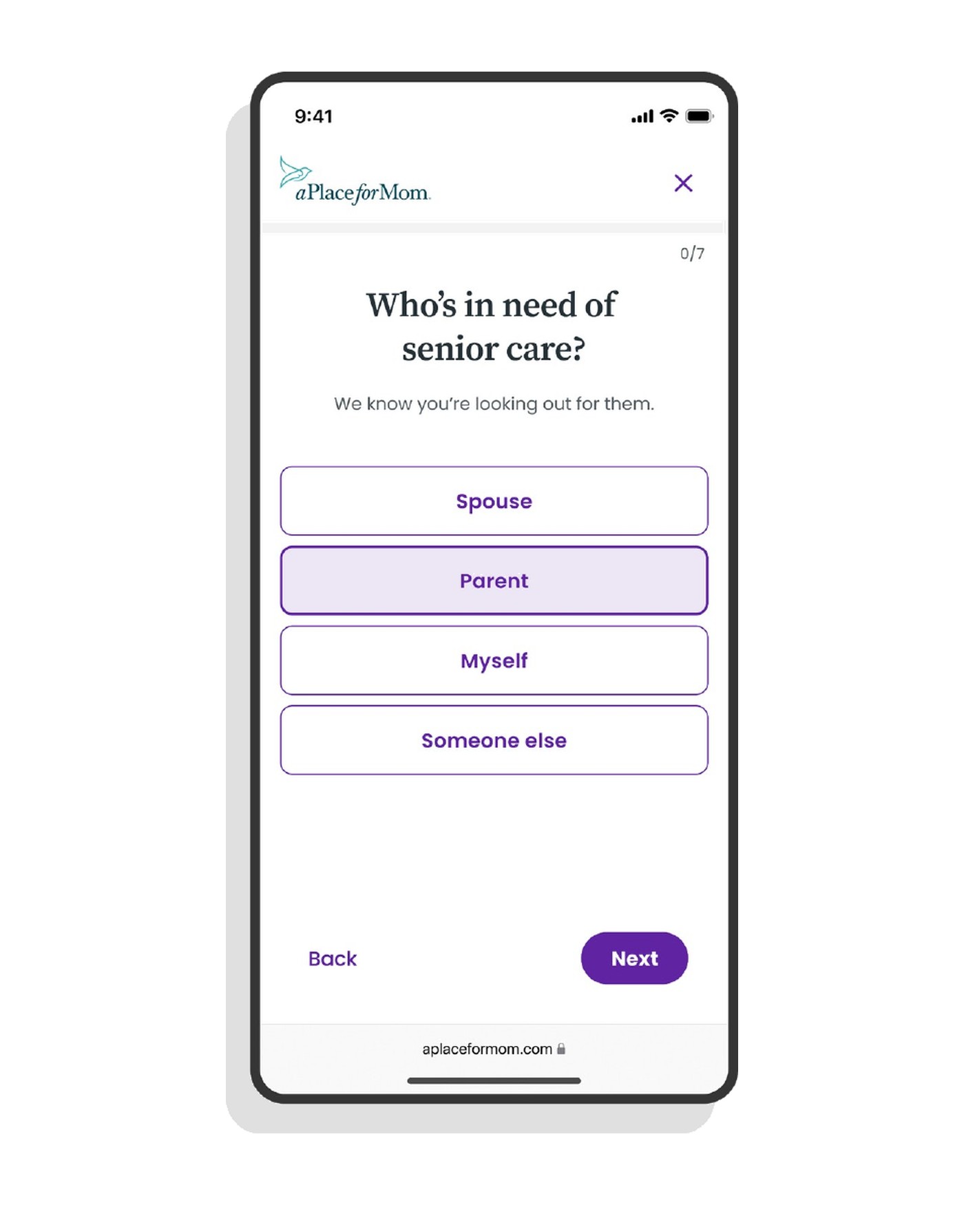
The strategy. With a full rebrand off the table, I focused on making the existing assets feel welcoming. I replaced heavy, realistic photos of people with approachable icons and illustrations to lower the barrier to entry, and gave each brand color a clear psychological purpose. The new approach was validated through A/B testing.
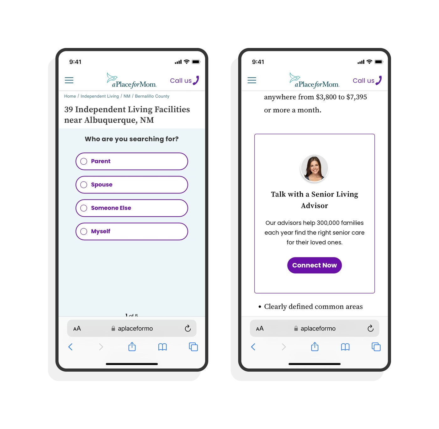
Focus ambiguityUsers ignored the calls to action, because random color usage and disjointed UI made them feel like untrustworthy ads.
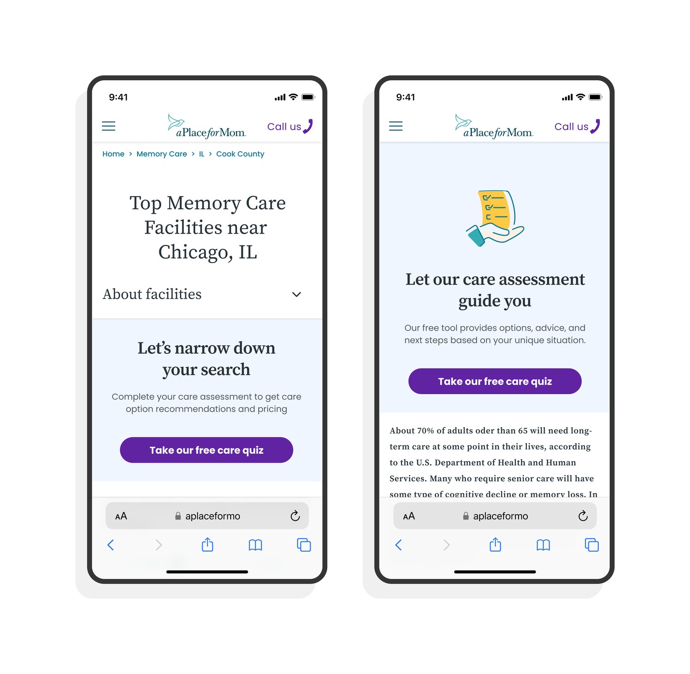
Strategic harmonyApproachable illustrations and one unified entry point build a bridge of trust.
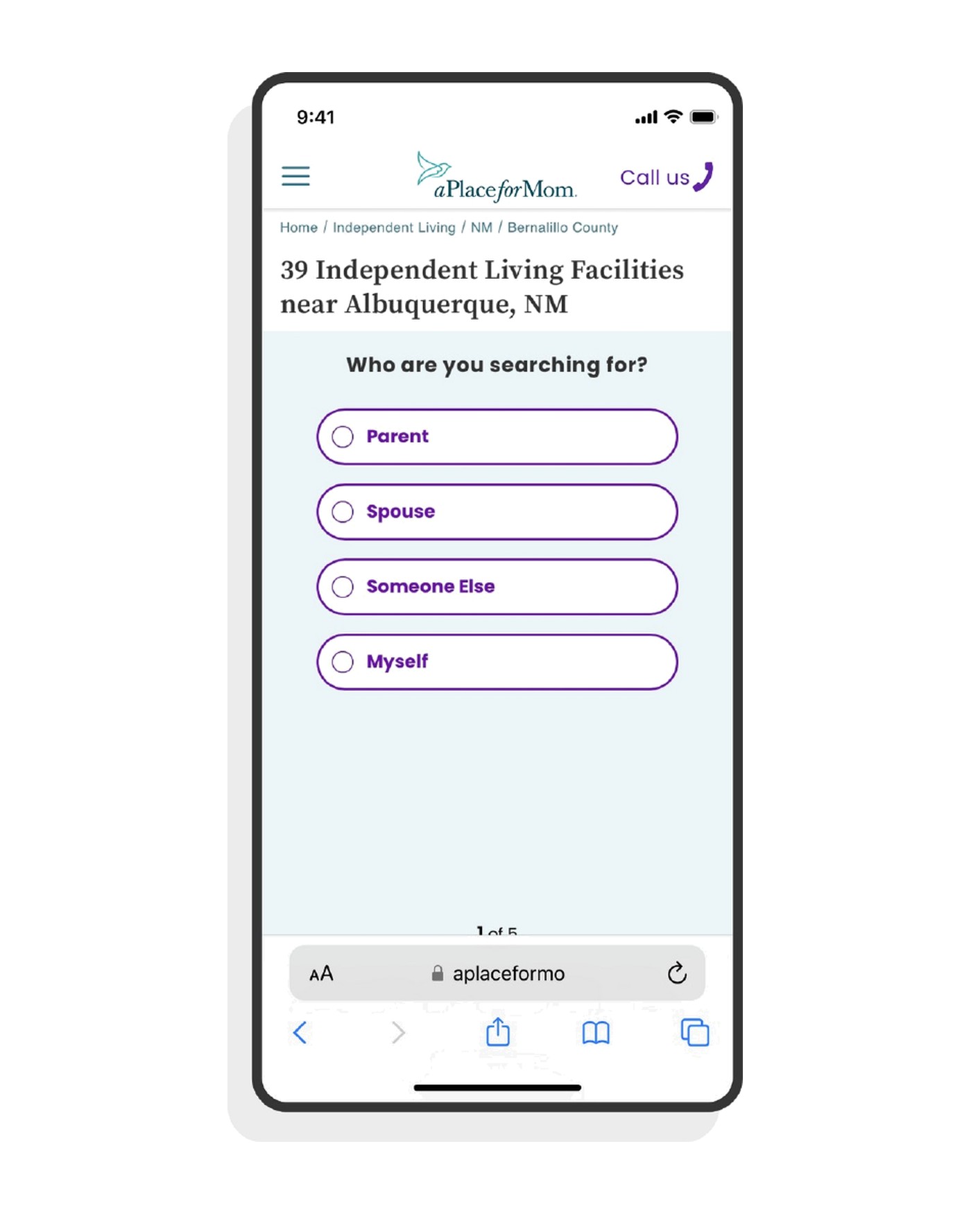
I separated the two conflicting brand colors. Primary green anchors the broader site in trust and a welcoming atmosphere, while the warm secondary purple is reserved strictly for the intimate care assessment flow.
02 The Missing Map
Building the Map MVP
The insight. A map view is an absolute MVP for a localized senior living search. But auditing competitors such as Aegis Living and Caring.com showed that A Place for Mom was the only service without one.
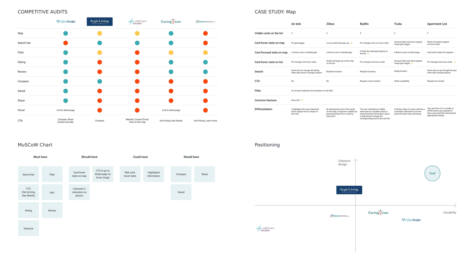
Competitive auditFour steps of research: the feature audit, a map case study, a MoSCoW chart, and positioning.
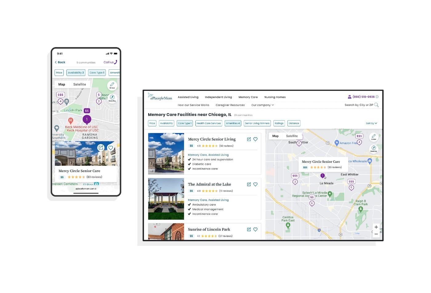
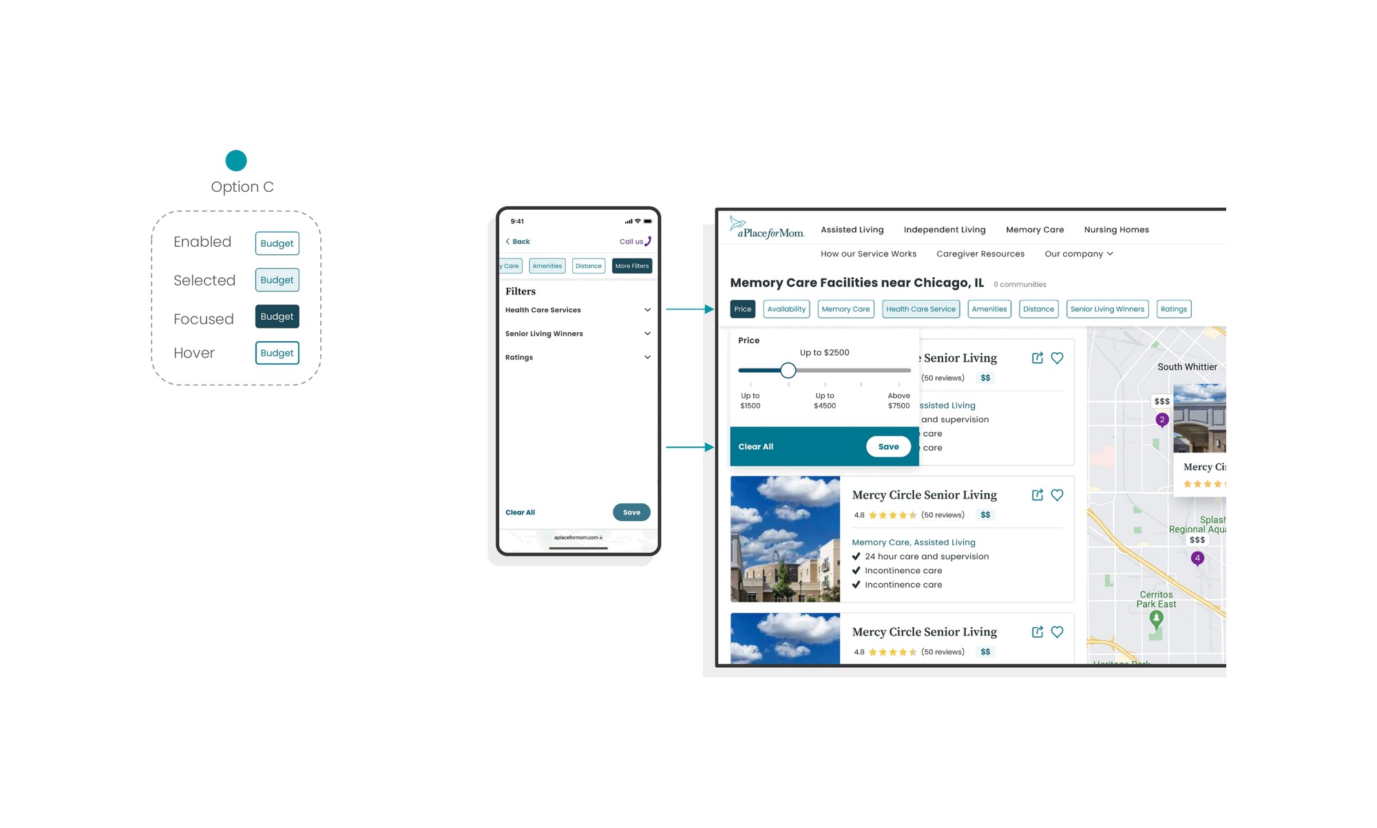
I designed the entire map feature from scratch in one week. That meant working at a very fast pace: designing the end-to-end UX flows, crafting the visual components and iterating through daily client feedback sessions.
03 Accessibility
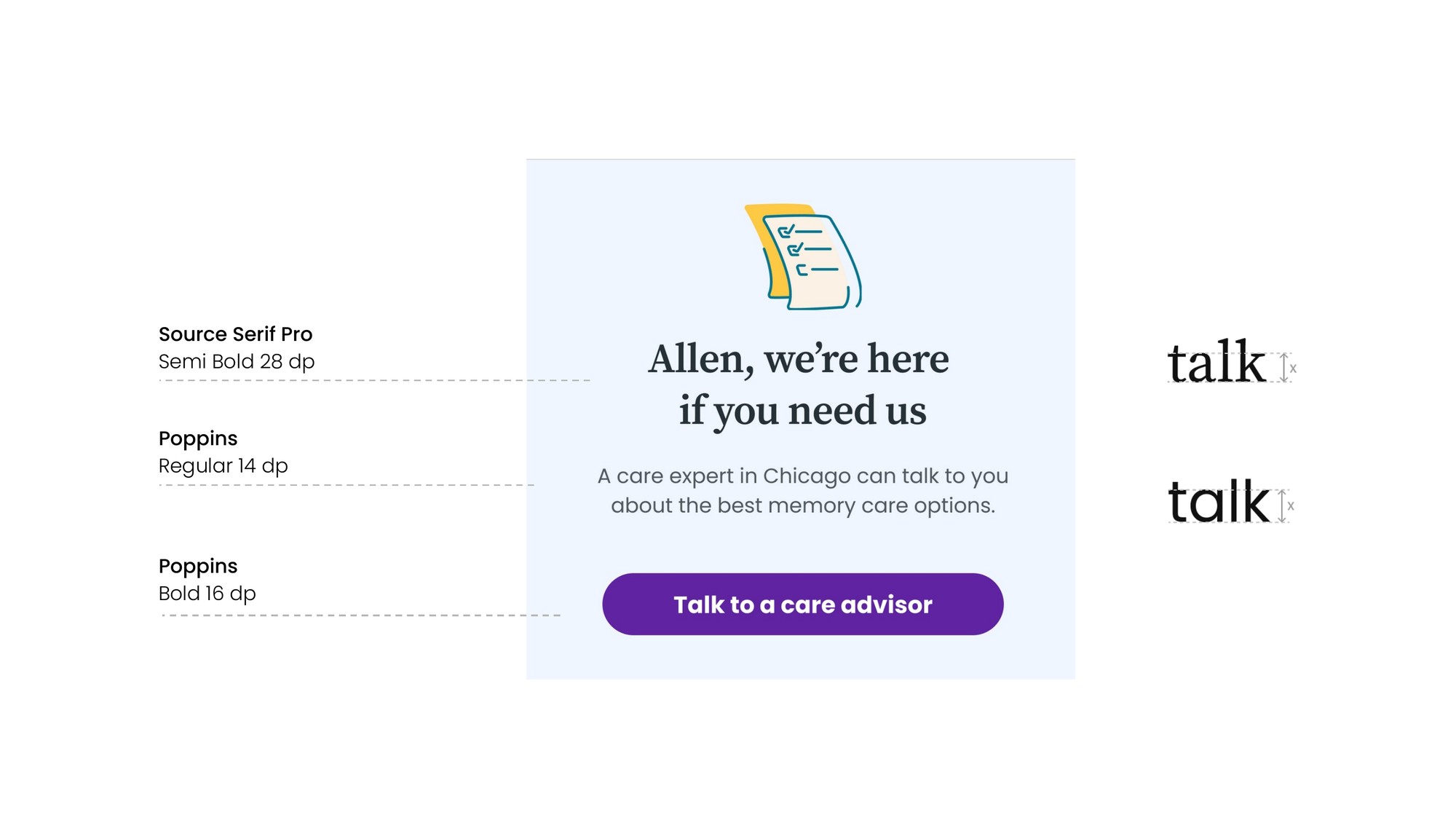
For a senior audience, good design starts with clear typography. The client restricted any change to the brand typefaces, so I focused on maximizing readability within those limits: the existing serif for comforting, humane headers, and the high x-height sans serif strictly for the body, where legibility matters most.
04 Reflection
When our grandparents use a service like this, they are often making difficult decisions in a vulnerable or urgent state. For them, good design isn’t just about aesthetics — it starts with something as fundamental as typography. The client wanted to minimize drastic changes to their brand assets, so my role wasn’t to reinvent the wheel but to make the existing one work. By maximizing readability and applying a welcoming tone, I made the interface accessible. This project reminded me that designing care for the user starts from these small, foundational details.
Balancing these deep user needs with the client’s business goals required constant communication, strict prioritization, and scope balancing. Throughout the project I switched hats between UX designer, advocating for intuitive user journeys and building the map MVP in a single week, and visual designer, crafting a cohesive system within locked visual constraints.
Navigating these requirements and fast-paced iterations was a testament to collaboration. It proved to me that you can beat any hardship with strong teamwork and a shared empathy for the people who will actually use the product.