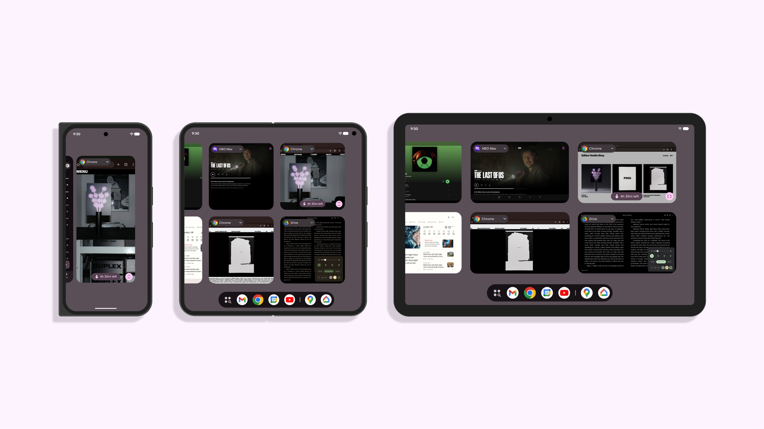
Google · Android
The challenge. Moving Overview to a denser grid on large screens took away the space for smart action buttons, which broke accessibility and consistency across devices.
The approach. I ranked every feature on the surface by function, then tested one hypothesis: what if extraction moved to Select mode, where the same tools already lived? Usage data confirmed it and aligned the team.
The impact. I set the rule for what belongs on Overview, and that definition prepared the surface to become Android’s multitasking hub. Pixel’s premium features now stay whole on every form factor instead of disappearing on foldables and tablets. Switching off extraction that barely one percent of users touched also took redundant processing off the device, which helps battery life.
01 Context
Why it matters
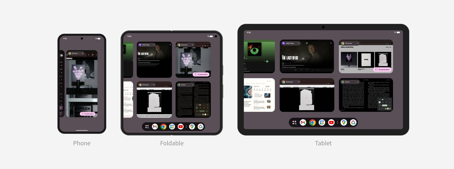
Overview is the central intersection every Android user passes through daily. As displays scale up, it grows from a simple app switcher into a hub for Desktop Windowing and the broader multitasking features.
Grid update
To support emerging multitasking capabilities such as drag-and-drop split screen, the layout required a higher density grid.
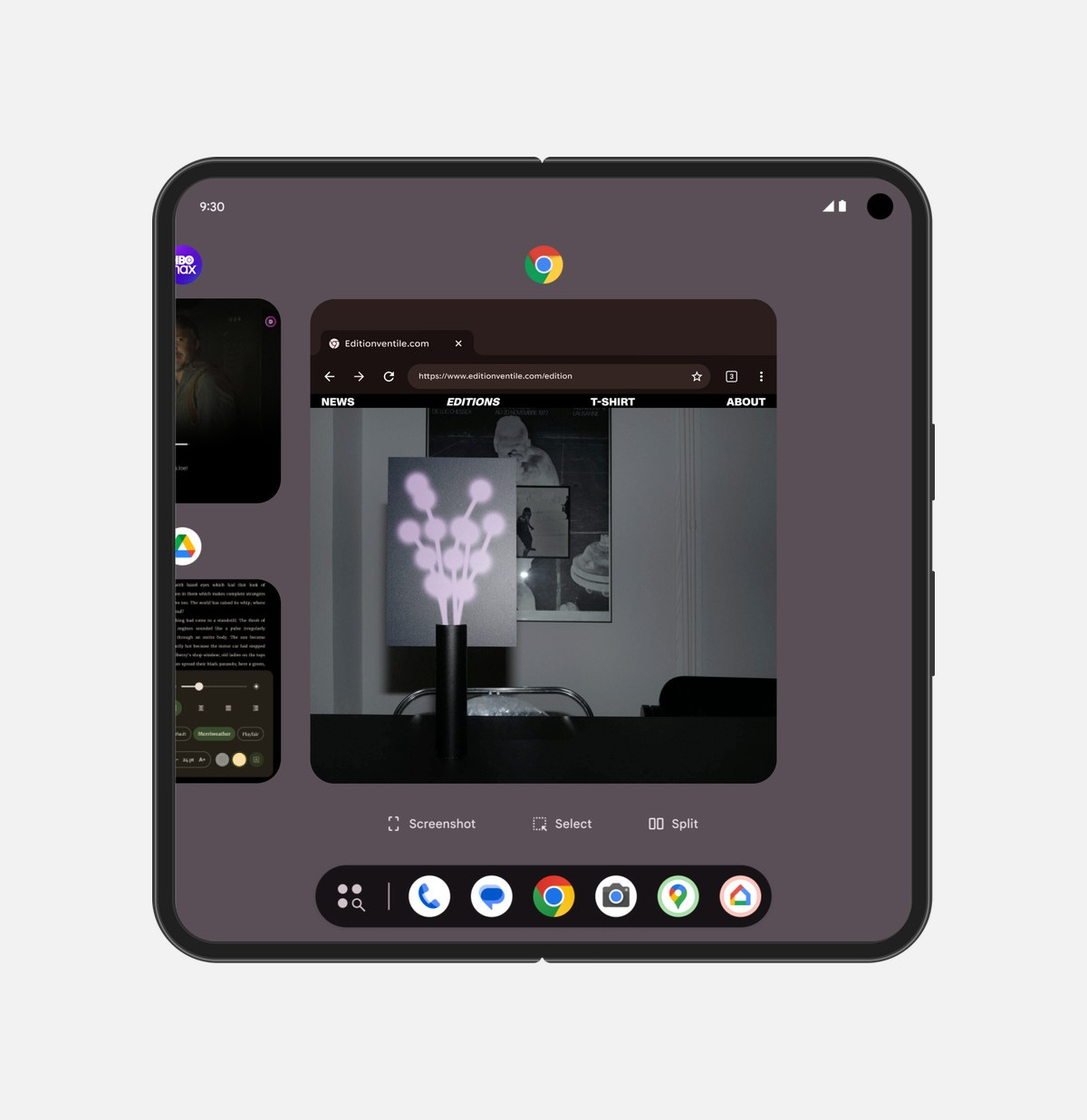
Single focused tileGenerous space allowed a dedicated row for smart actions underneath.
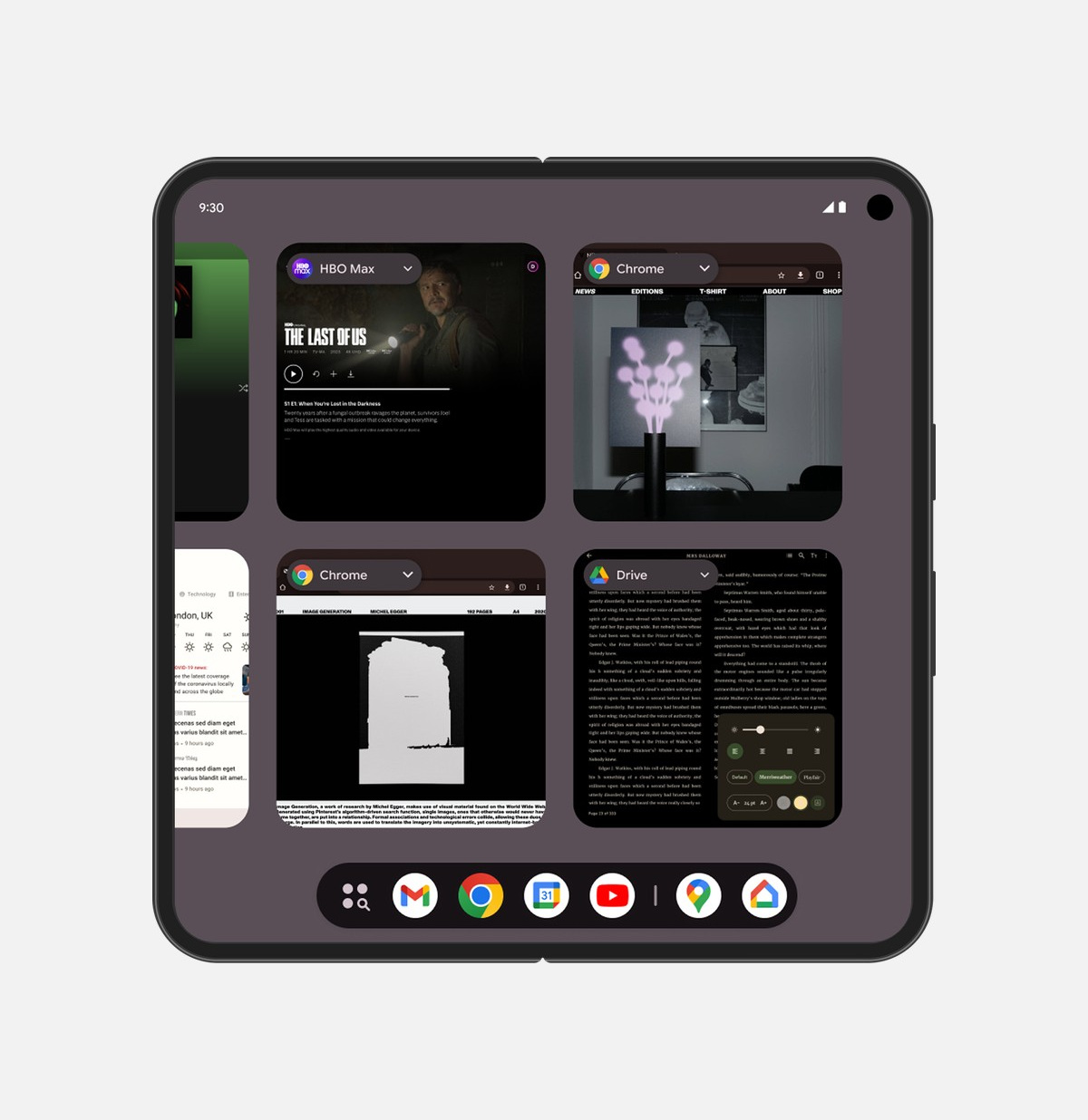
Uniform two-row gridDoubled app visibility, but completely removed the space for action buttons.
Drivers
Two forces pushed Overview to a new tile size and a new grid, and the gap this project closes opened here.
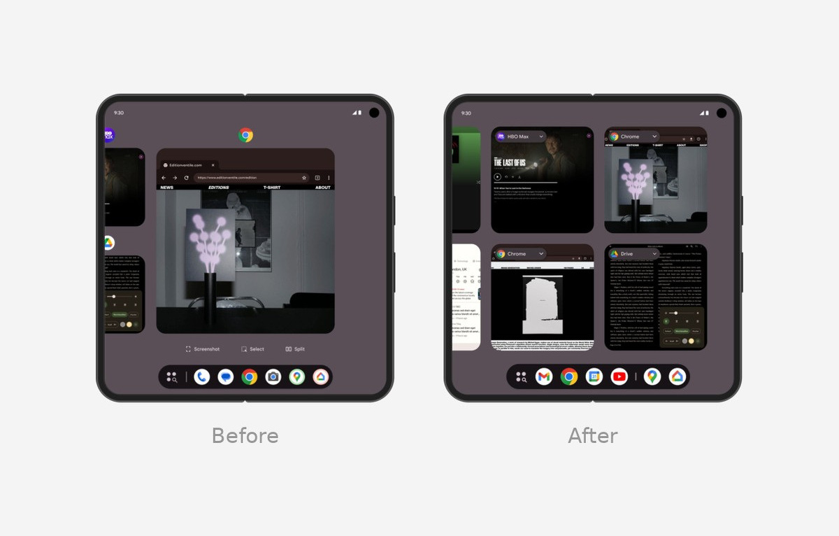
Users wanted to see more apps at onceEven on large screens only two or three apps were visible; unifying tile size more than doubled how many fit on one screen.
Becoming the multitasking hubDragging a tile straight into split screen was coming next, and that only works once tile size and layout rules are settled — so the grid had to change before the feature could land.
02 Problem
Spatial conflict
The denser grid forced smart actions off the screen on larger devices. Simply hiding these features to save space left three critical usability debts.
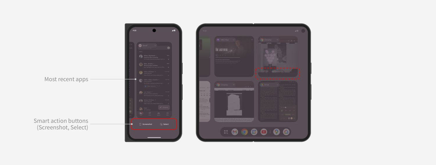
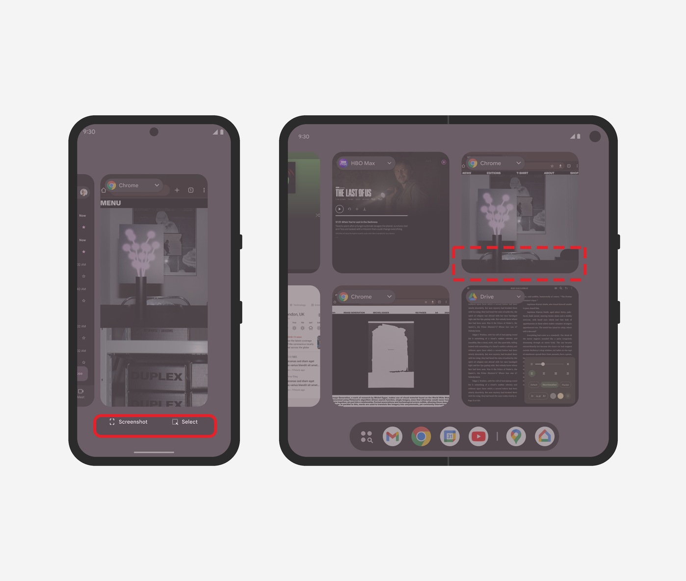
Device inconsistencyFeatures present on phones disappeared entirely on foldables and tablets.
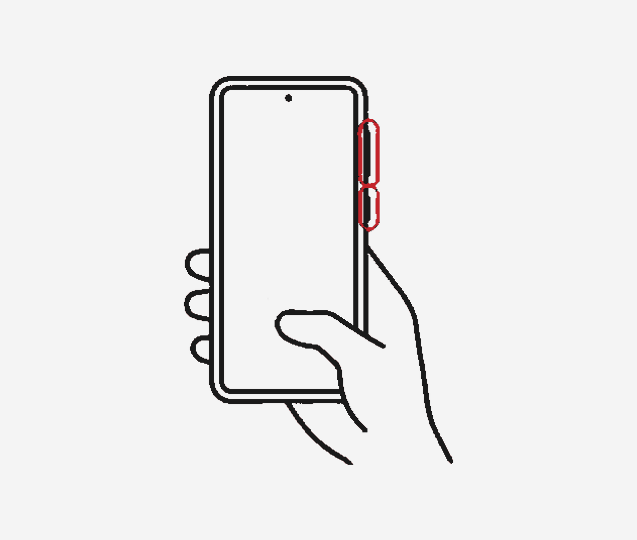
Accessibility barrierThe only software path for a one-handed screenshot was severed — the alternative is pressing two hardware buttons at once.
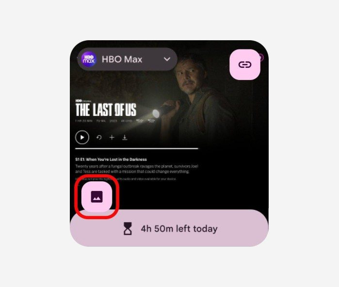
Feature collisionImage extraction and digital wellbeing occupied the exact same coordinate, and the existing fix was to switch extraction off.
03 Approach
Feature hierarchy
P0 · Essential

App chip
P1 · High-value — unique to Overview

Screenshot

Select

Digital wellbeing banner
P2 · Contents extraction

Link extraction

Image extraction
Fitting every button into a shrinking footprint is a losing battle against finite screen space. Relying on product intuition, I changed the question: instead of asking how to arrange the buttons, I asked if they belonged here at all. I sorted every intersecting feature into a strict hierarchy: essential, high-value, and contextual.
Hypothesis
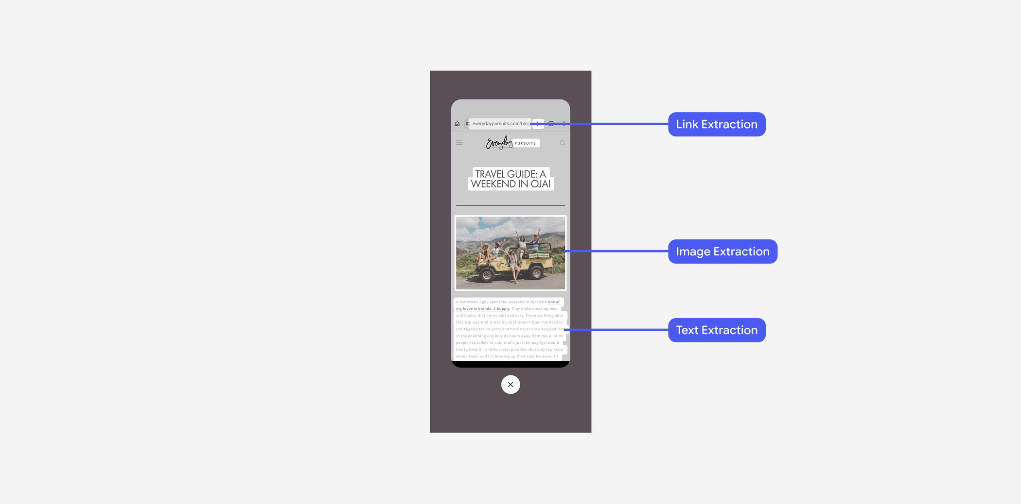
Link, image, and text extraction sat on the highest-priority spot of every tile. Yet Select mode already offered the same three tools, in the context where users pick content on purpose. My hypothesis: moving extraction out of the top layer would free the surface without taking any capability away.
Validation
When stakeholders pushed for a “more features are better” approach, I didn’t argue from taste. I tested the hypothesis against engineering telemetry.
The data confirmed it: the P2 contents extraction features accounted for barely one percent of usage, while duplicating capabilities already housed in Select mode. That result turned the hypothesis into the core decision: relocate contextual features to their native environment, and free the surface for essential actions.
04 Decision
Feature relocation
Migrating image and link extraction into Select mode removed redundant processing, which reduced power draw, and resolved the spatial collision on the top layer.
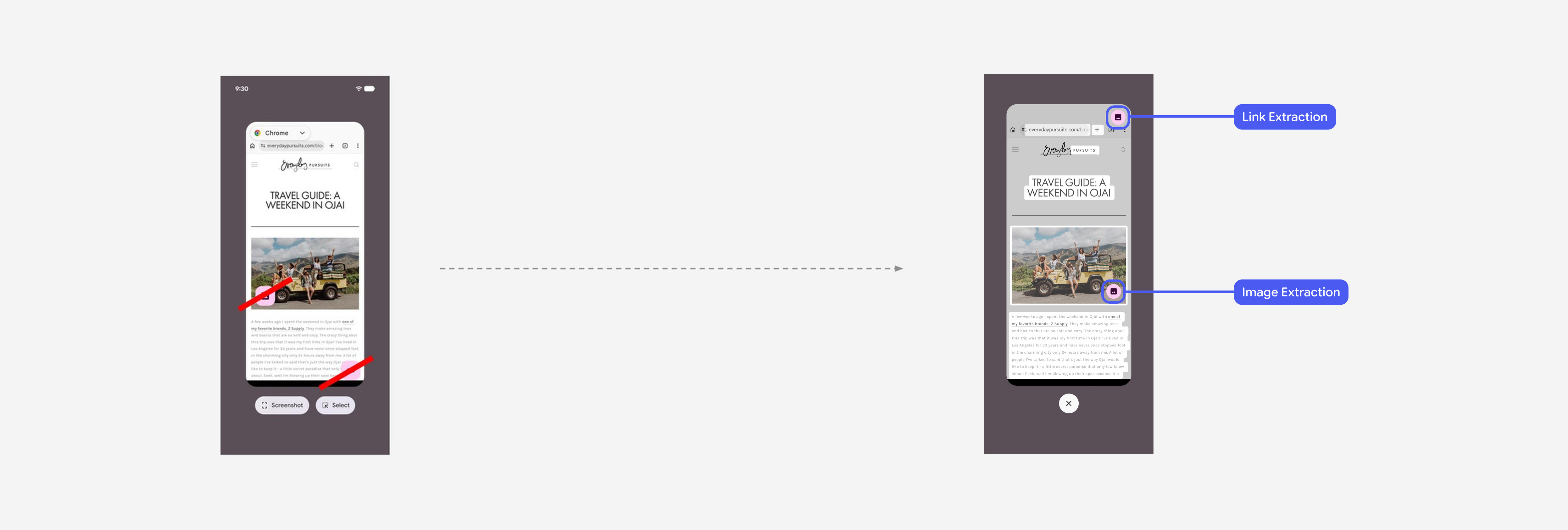
Before · Surface overload
Cluttering prime real estate
Low-usage features consumed critical space, forcing core actions off-screen on larger devices.
After · Contextual alignment
Consolidated mental models
Moving extraction to Select mode united related actions under a single, logical workflow.
Design iteration
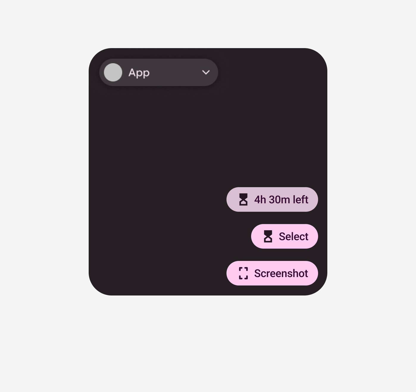
With the surface cleared, Screenshot and Select had to stay reachable in every system state, from default to maximum banner intrusion. I evaluated three placements.
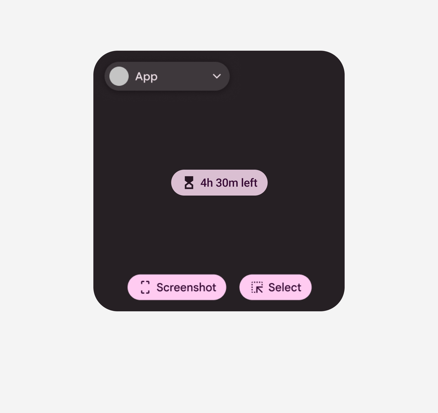
Accessibility failureUnpredictable contrast against the underlying app content.
Muscle memory breakShifting button positions severely impacts predictability.
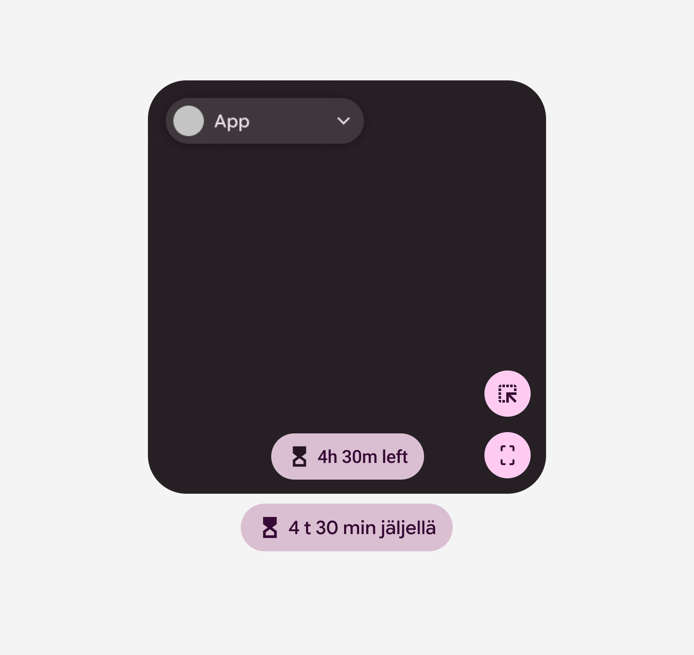
Clarity costSolves the spatial constraint, but drastically increases cognitive load for first-time users.
Further research showed no benefit to keeping Select and Screenshot side by side on the primary surface. I moved Select to the chip menu, leaving Screenshot as the only protected action on the main layer.
05 Result
Adaptive UI rule
The final rule responds to available space: a clear text label by default, compressing to an icon only when edge-case banners demand maximum space.
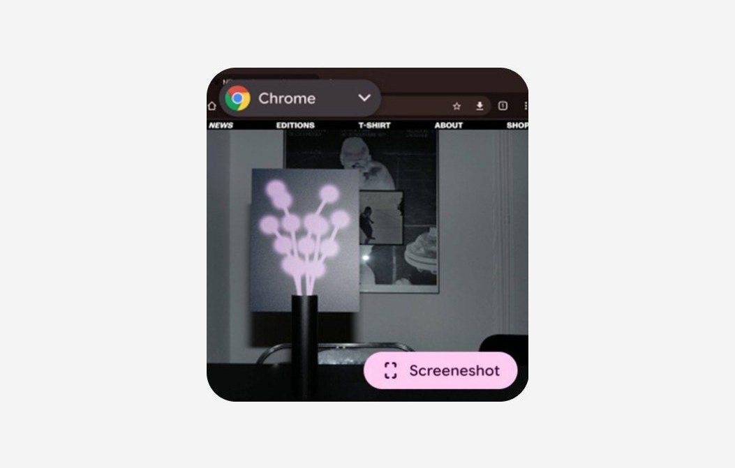
Optimized for clarityA full text label leaves no ambiguity for users.
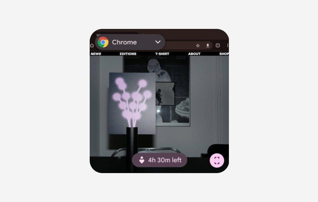
Graceful degradationCompresses to an icon only during rare banner intrusions, keeping the function.
Device consistency
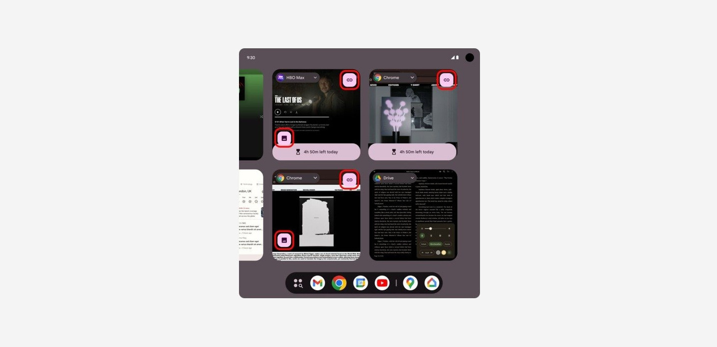
Redundant controlsEvery tile surfaced extraction controls, whatever the task.
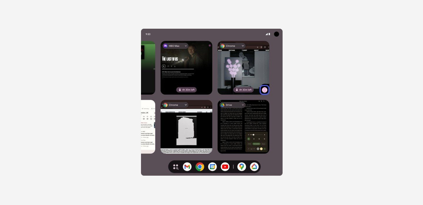
Contextual anchoringOne action, anchored to the tile in use.
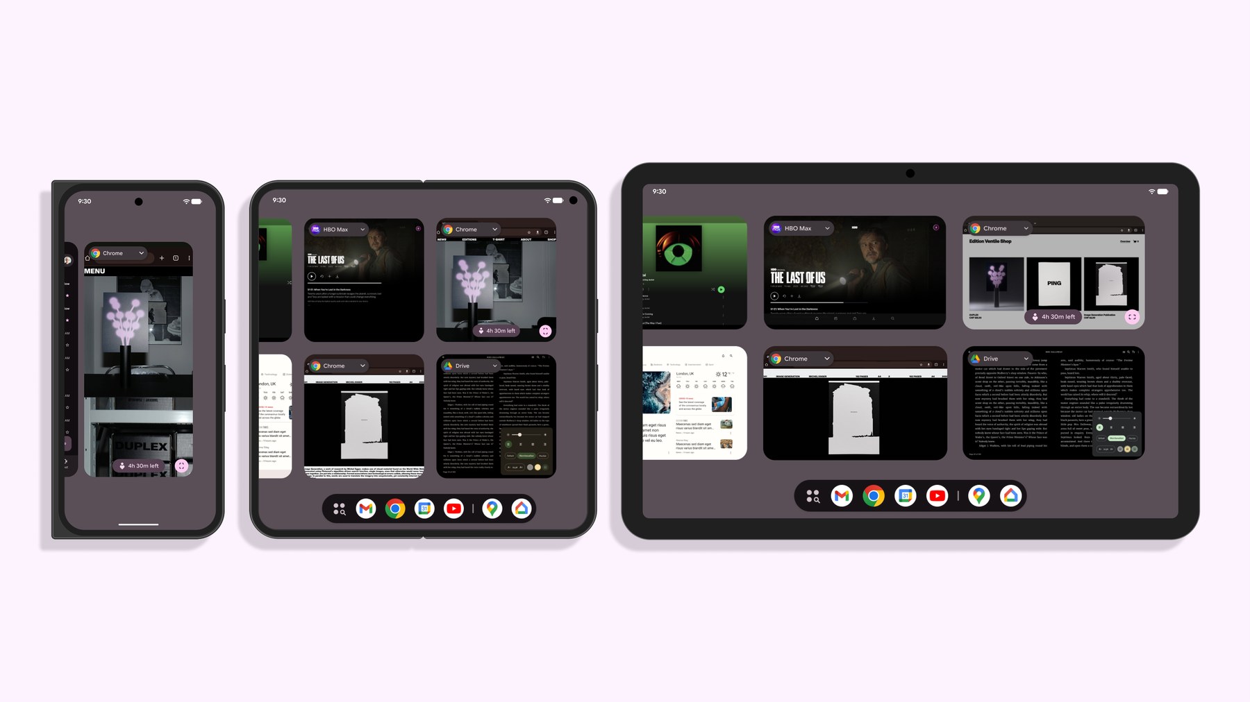
One rule now runs across every form factor. Features that used to vanish on foldables and tablets stay in place, with no exception layouts to maintain.
Reflection
Good visual design isn’t about cramming every button onto a screen. It’s about understanding user intent and building the structural rules that serve it.
Users don’t read design guidelines; they experience predictability. That invisible system integrity is the true measure of design success.